
A look behind the design intent, process, and materials that make paper, work…
Shai Gilgeous-Alexander;
April, 2024
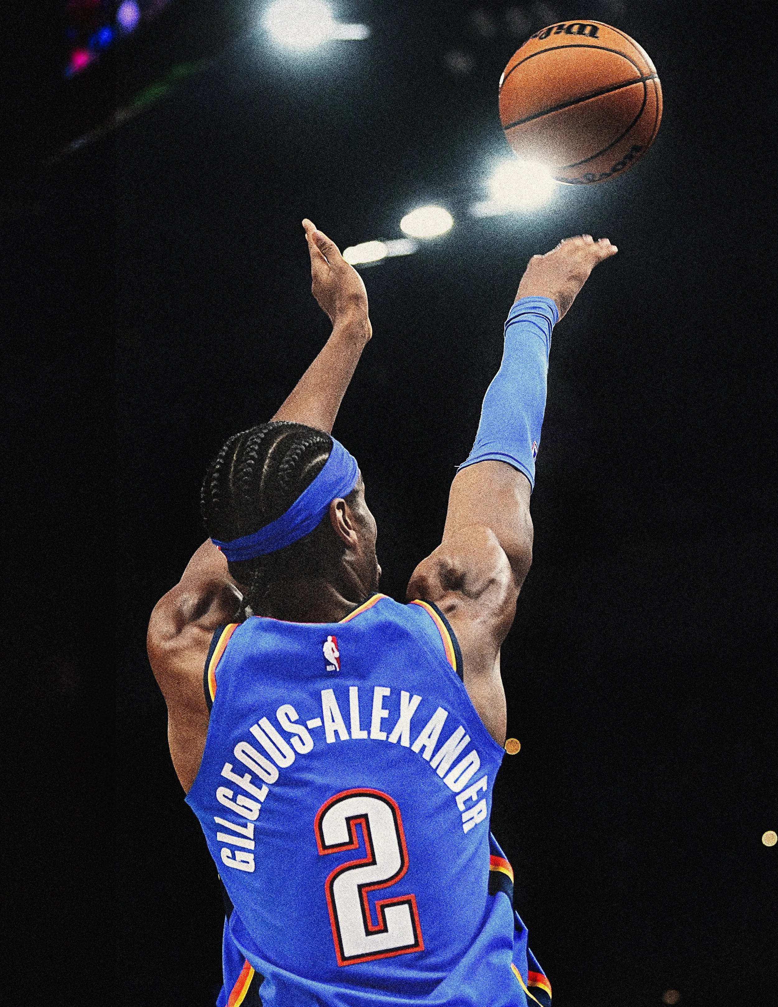
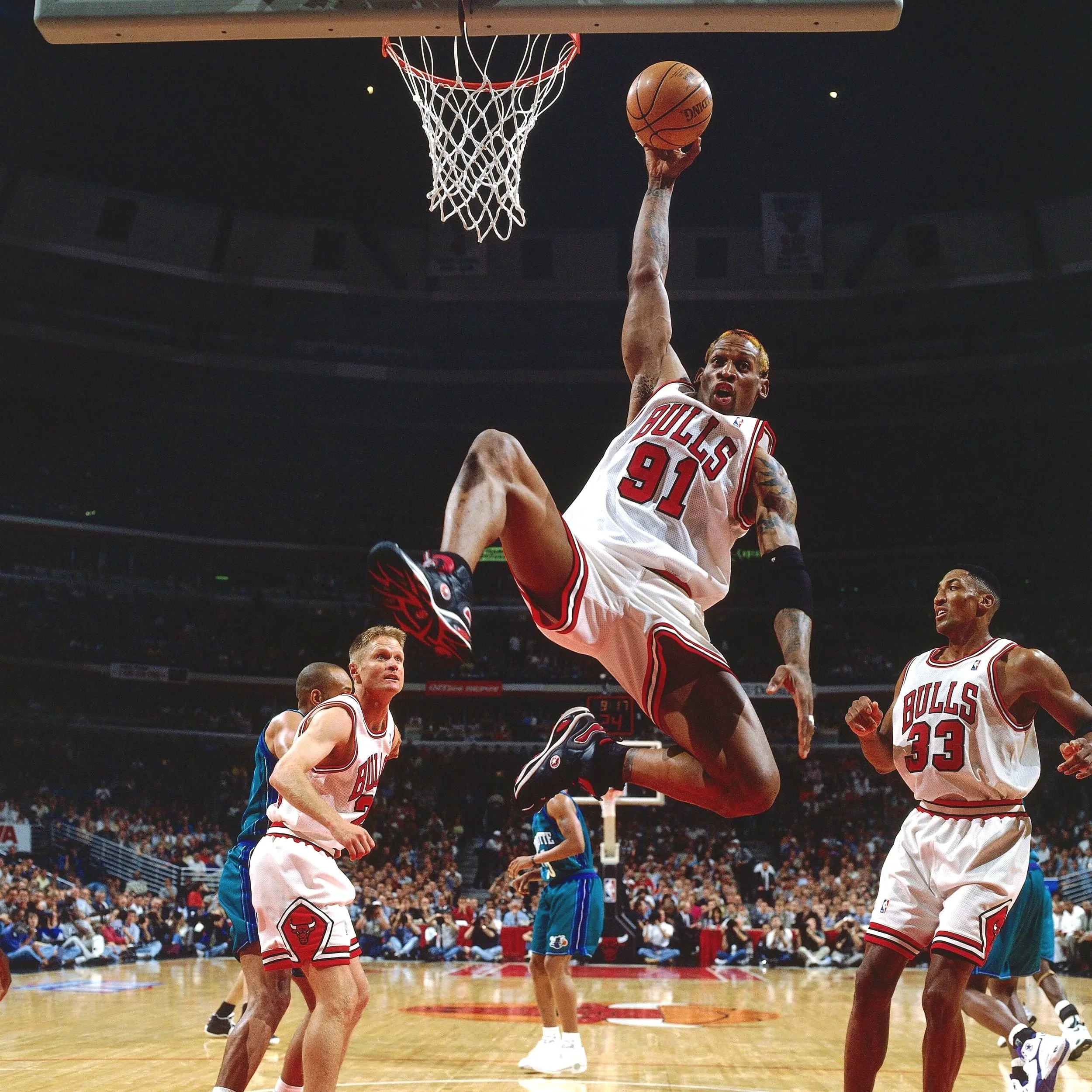
Reference image
Dedicated to the rising star and eventual 2025 league MVP; this is the piece that started it all.
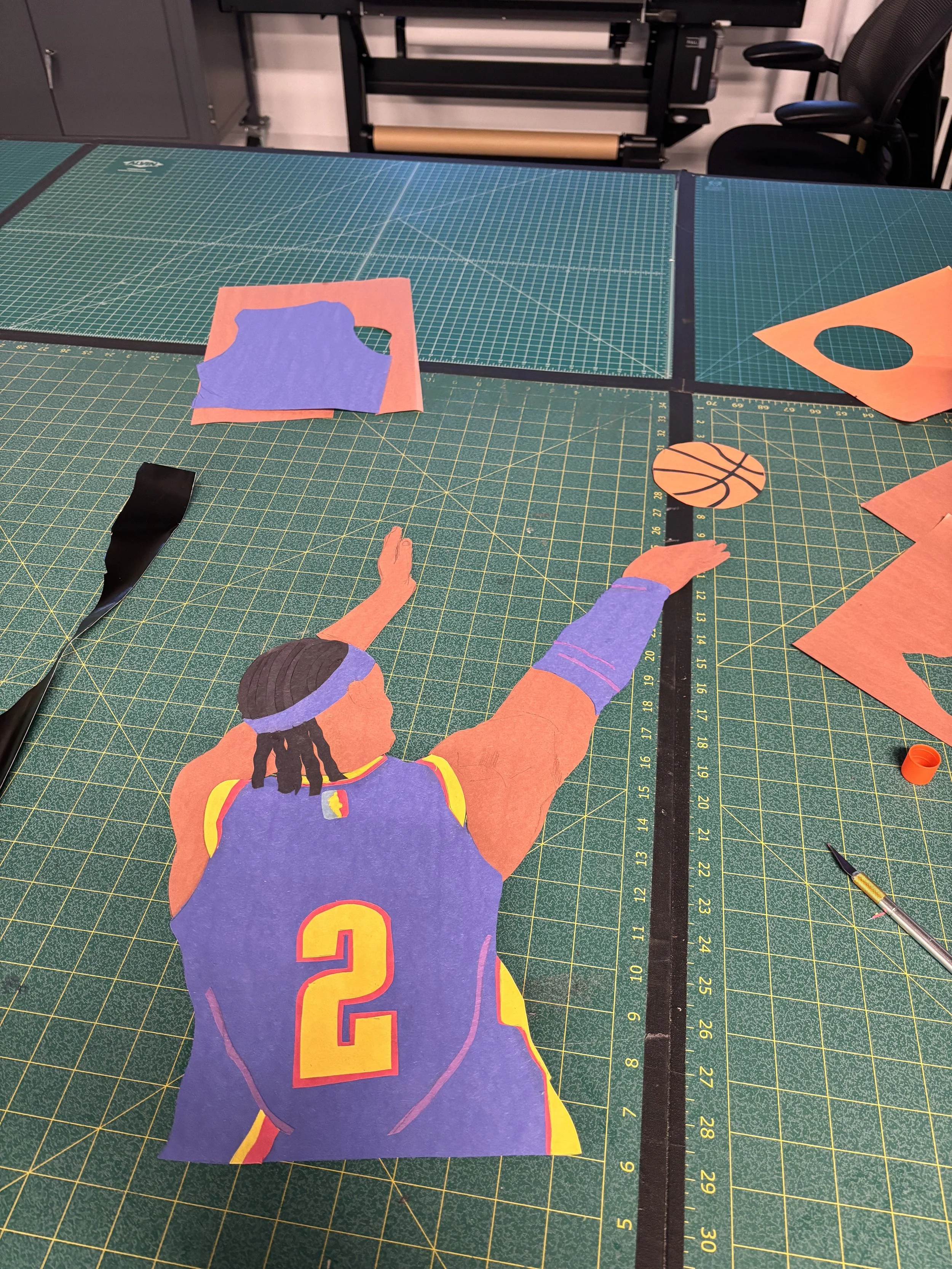
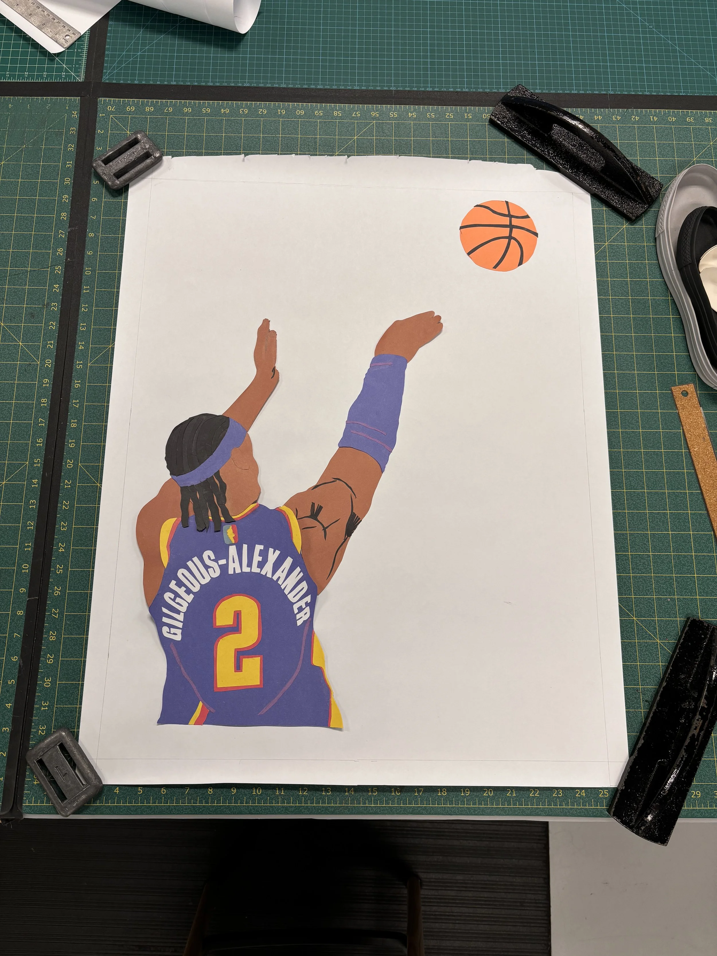
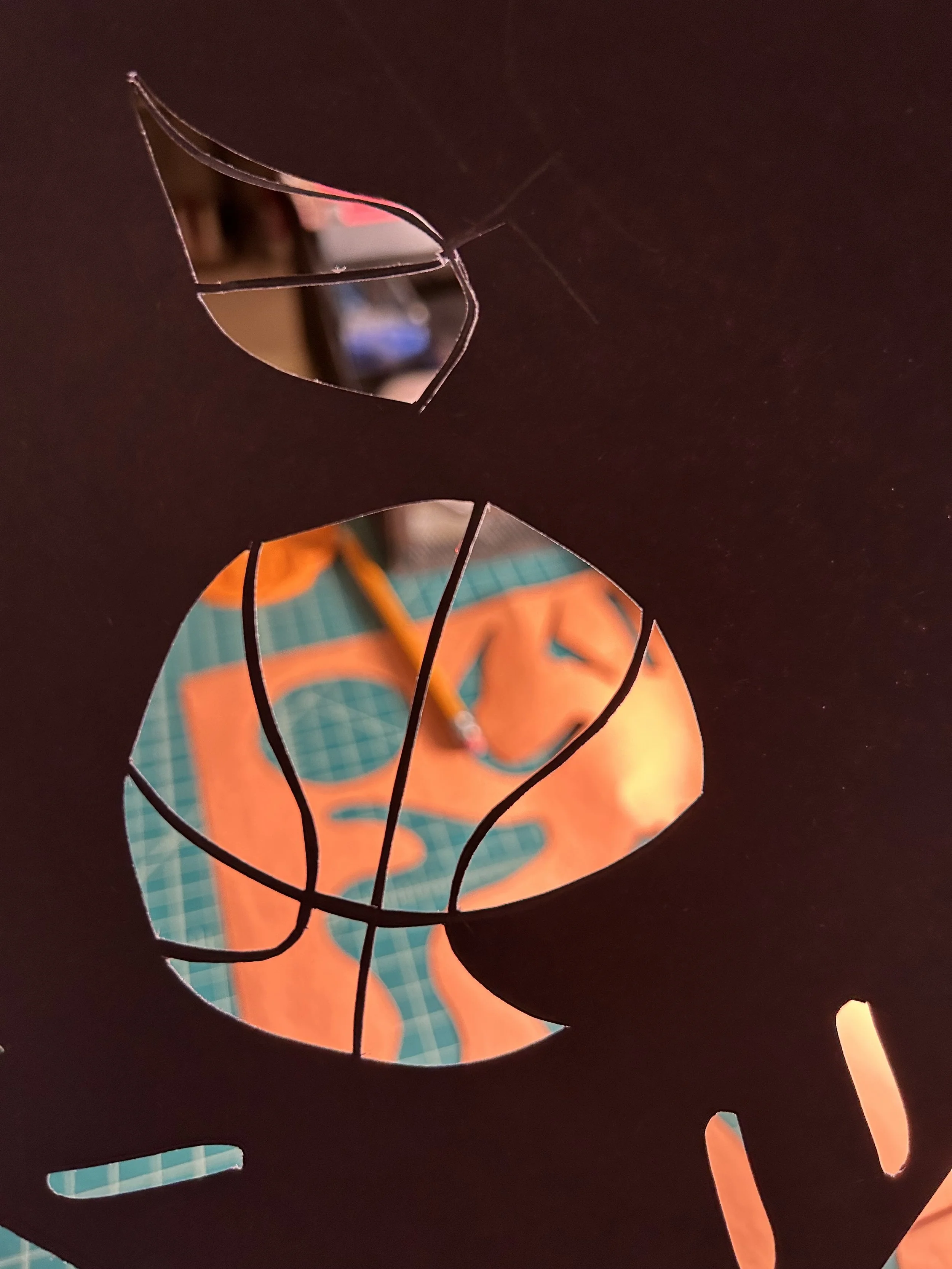
My first piece ever. I started off by eye balling the shape of the reference image and cutting that into the paper
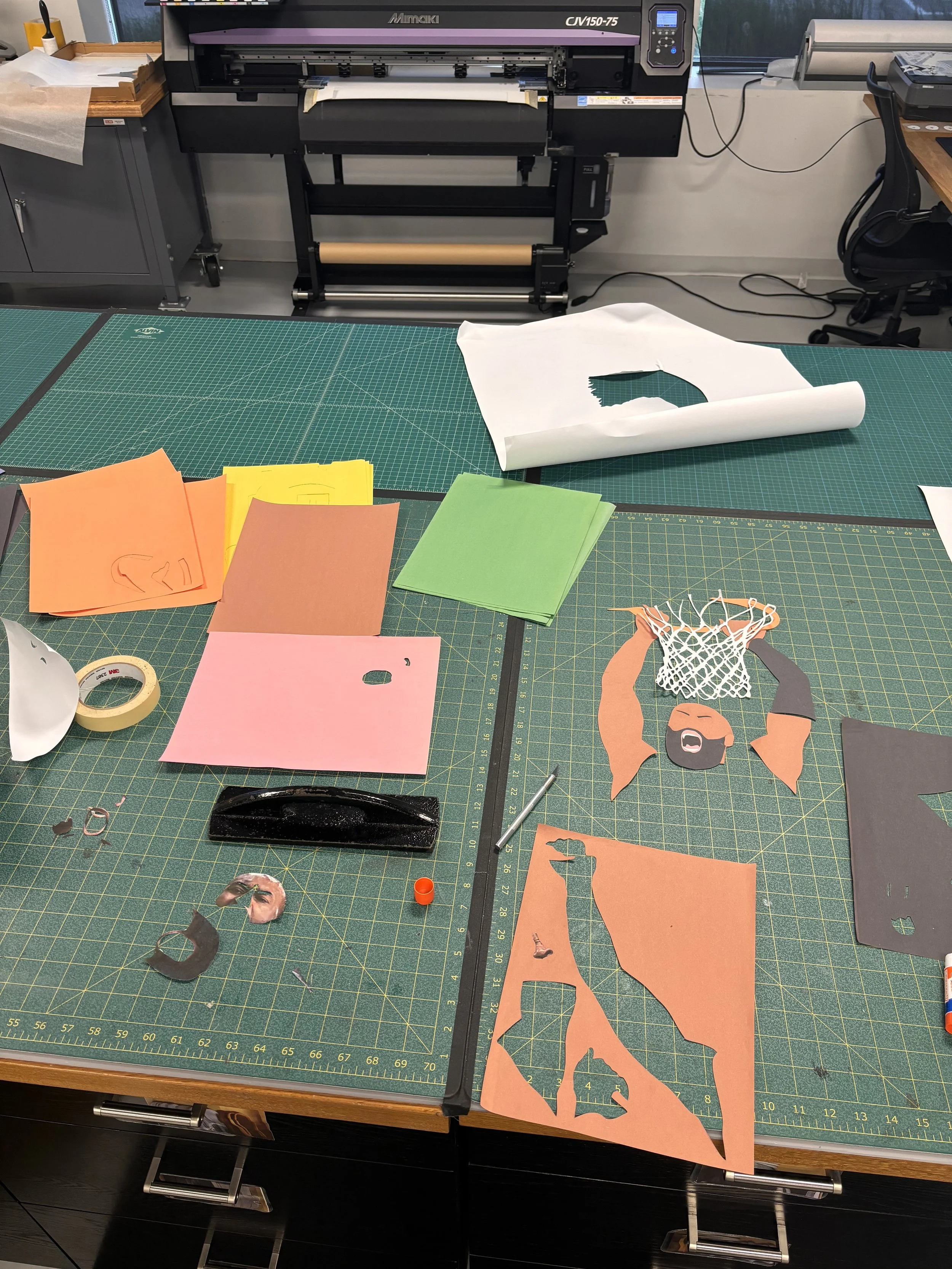
A look into the unrefined, chaotic workspace behind the first piece
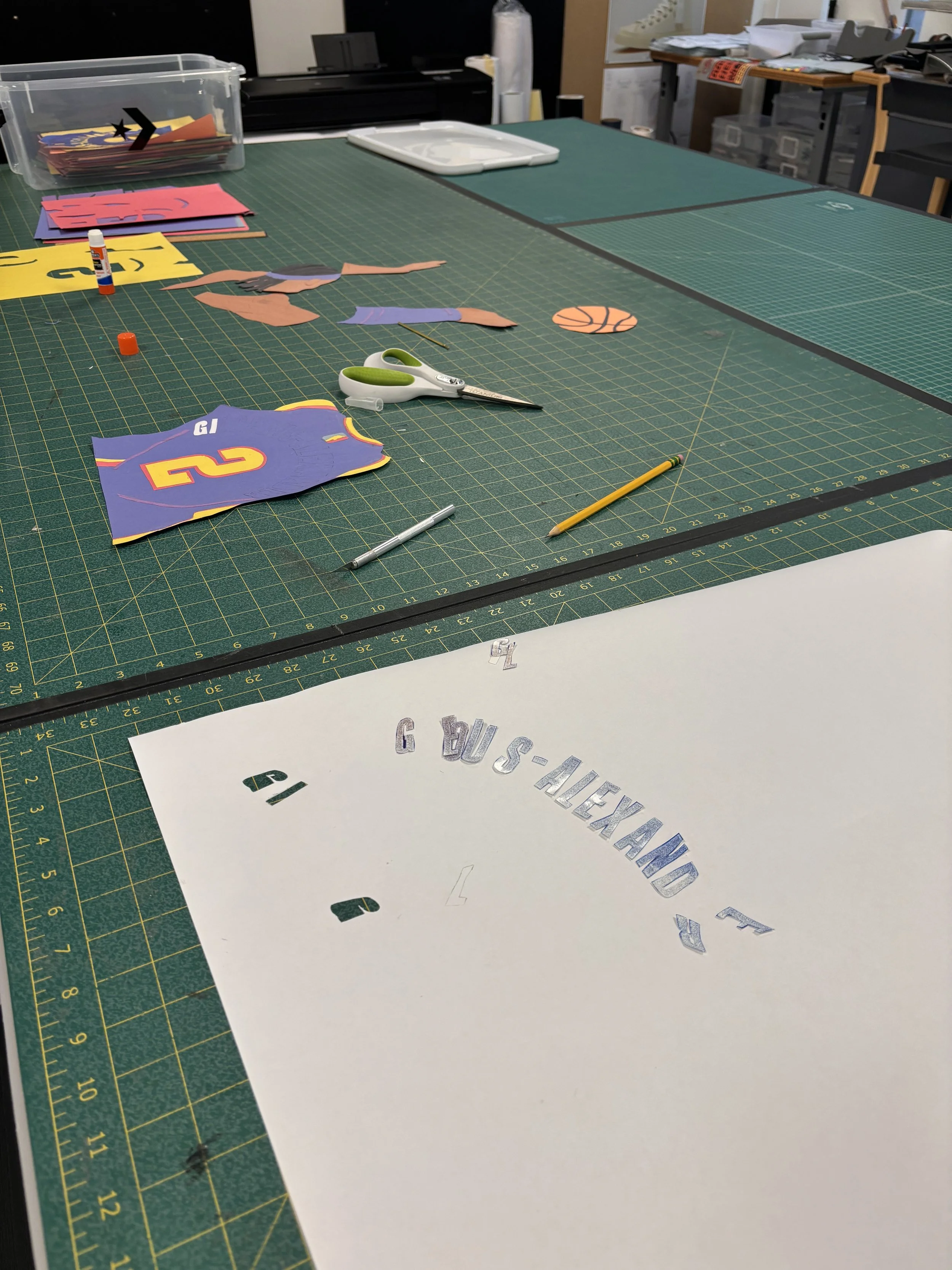
To execute the lettering, and without a tracing table, I cut out each letter from the reference, traced it on paper, then cut the final letter
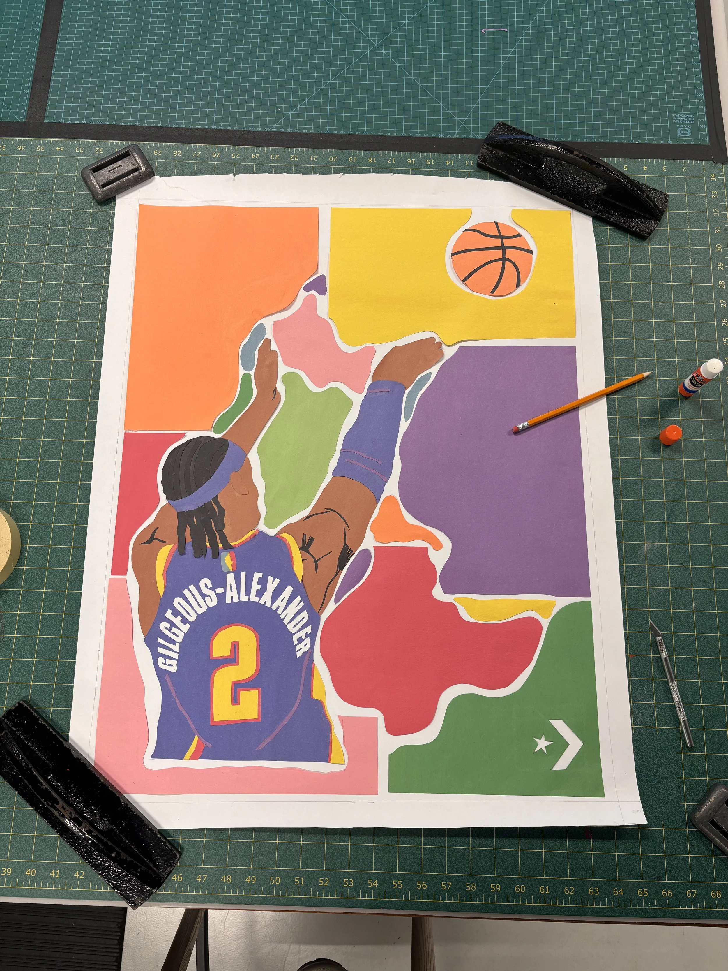
I had no idea or direction of how I wanted the shapes to look. I started with the corners and then filled in the gaps to arrive at this final form
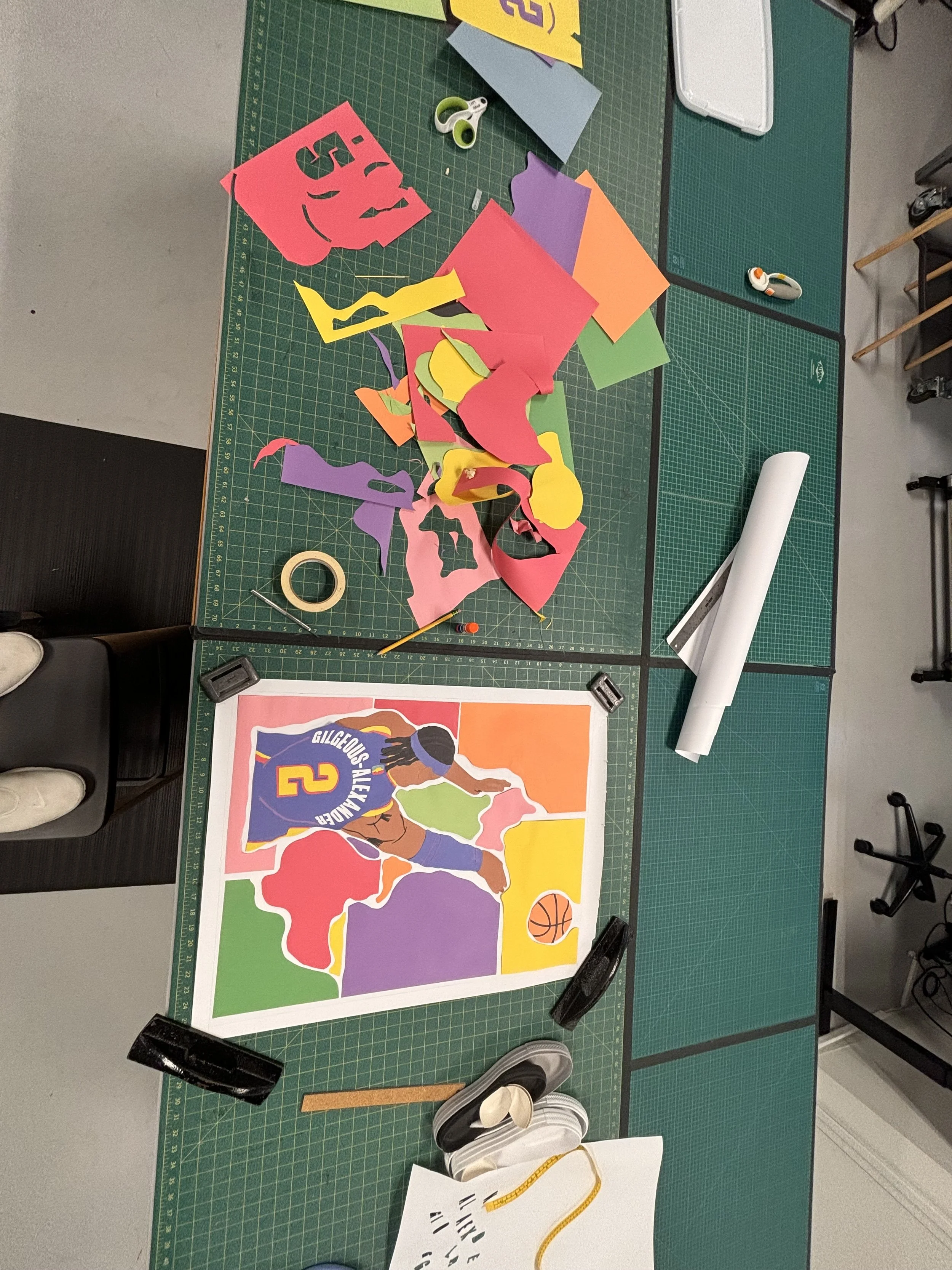
This was my first time envisioning what the background could be. My inspiration was a Matisse painting I had seen in a gallery on Newbury Street

Final product
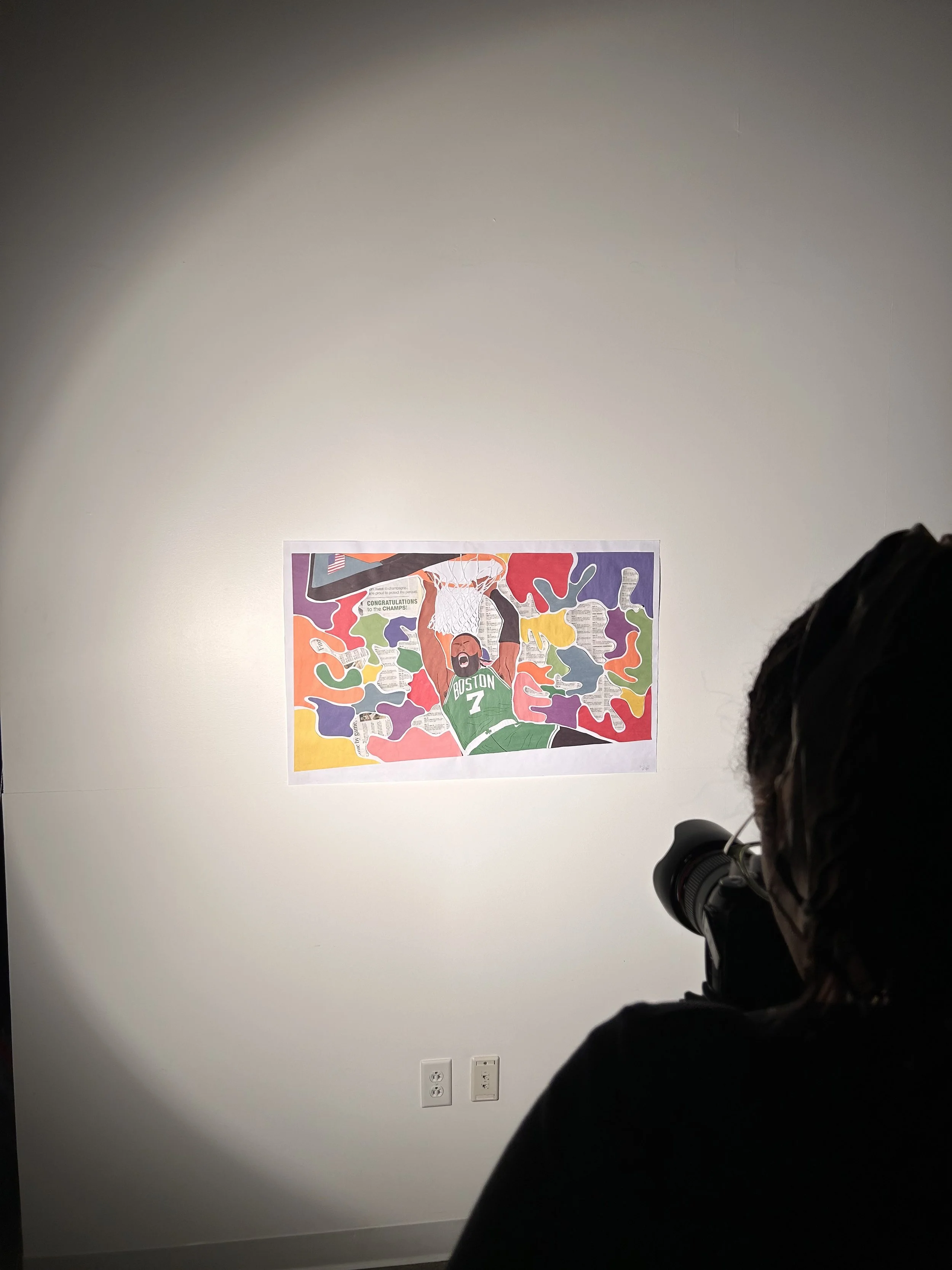
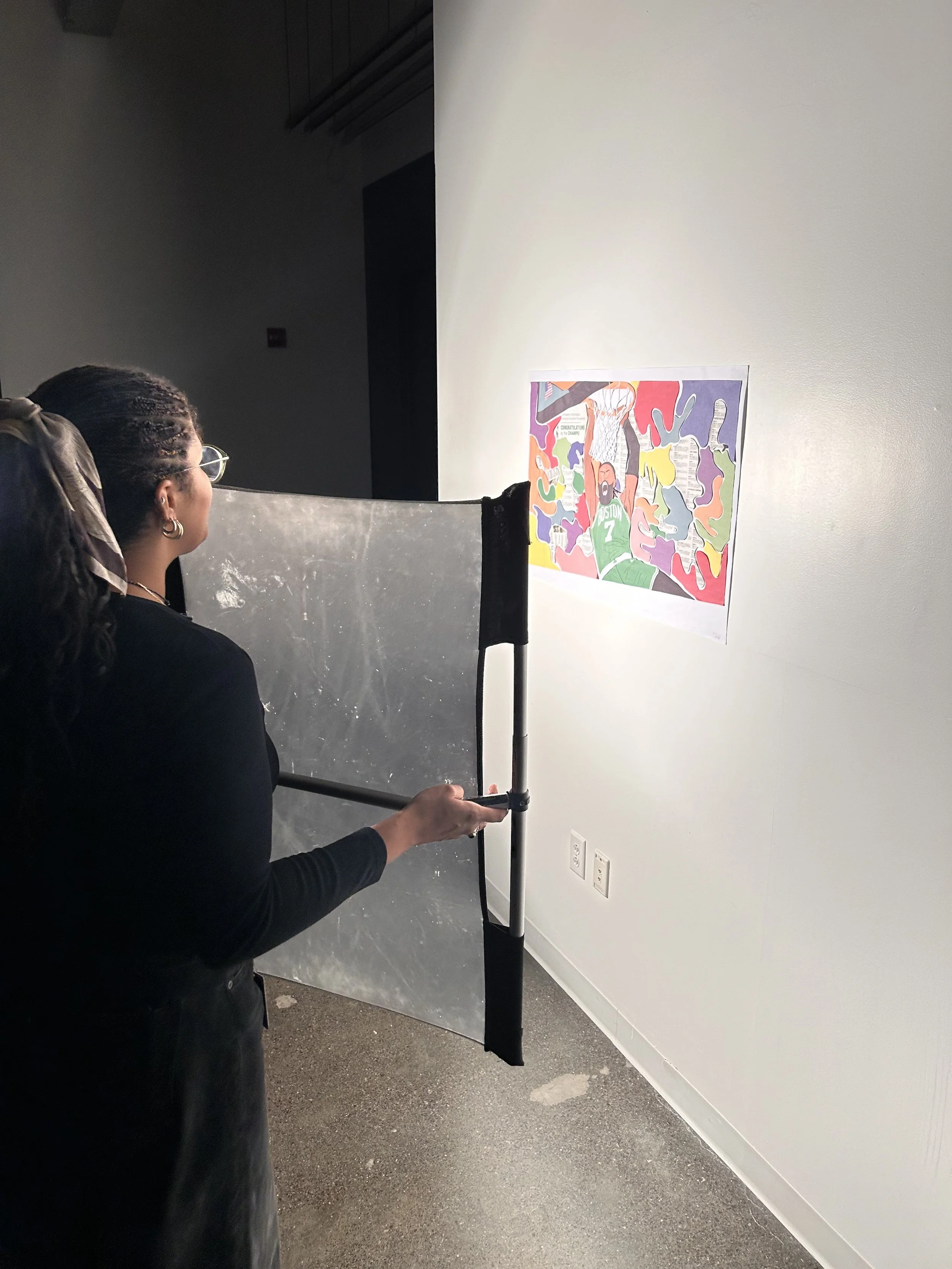
Jaylen Brown; September, 2024
Reference image
I grew up a Celtics fan. Living in Boston the last 7 years has made my passion for the team grow even more. Amongst the superstars of the league Jaylen Brown stands out for his aggressive style of play and ‘silent assassin’ approach.
This piece pays homage to him, and the 2024 NBA Champion Boston Celtics.
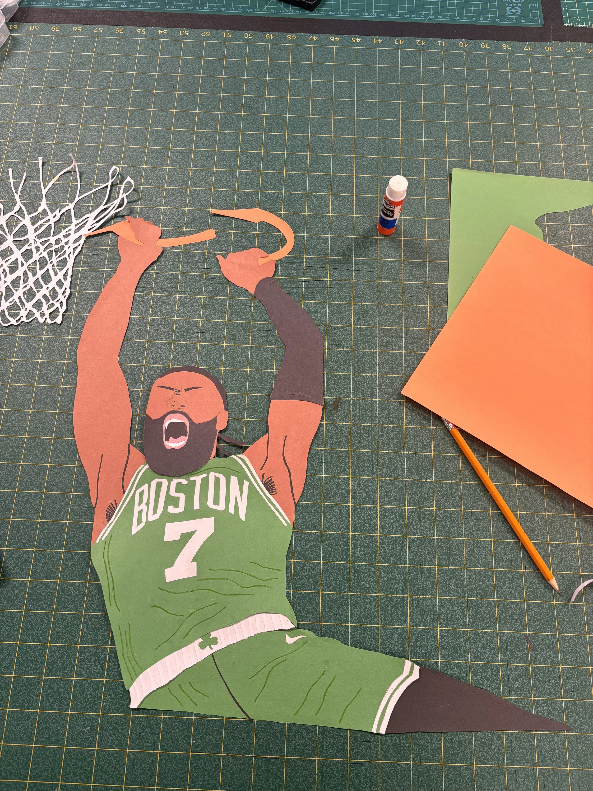
The shapes started to become more accurate when I cut the reference image out, traced it over the paper, and then cut it out
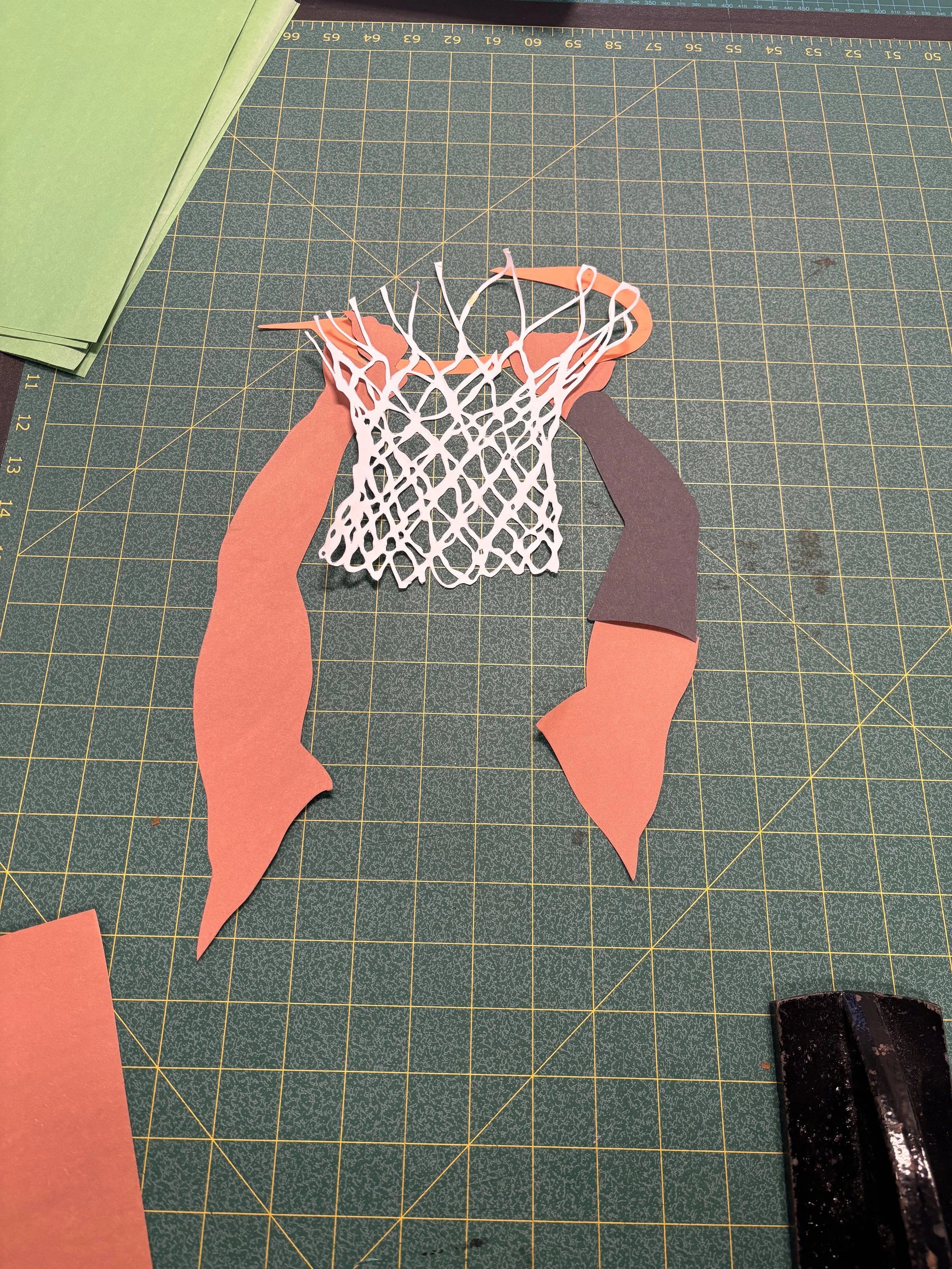
This was my first time hand cutting a net from paper. A tedious task, but this has become one of my favorite details
My first time using the idea of a tracing table to create cleaner paths between the abstract shapes. The only problem is, I didn’t have a tracing table
Net cutting timelapse
Ideally, how you cut the pieces, and how they fit together should be 1:1, but it doesn't always work out that way

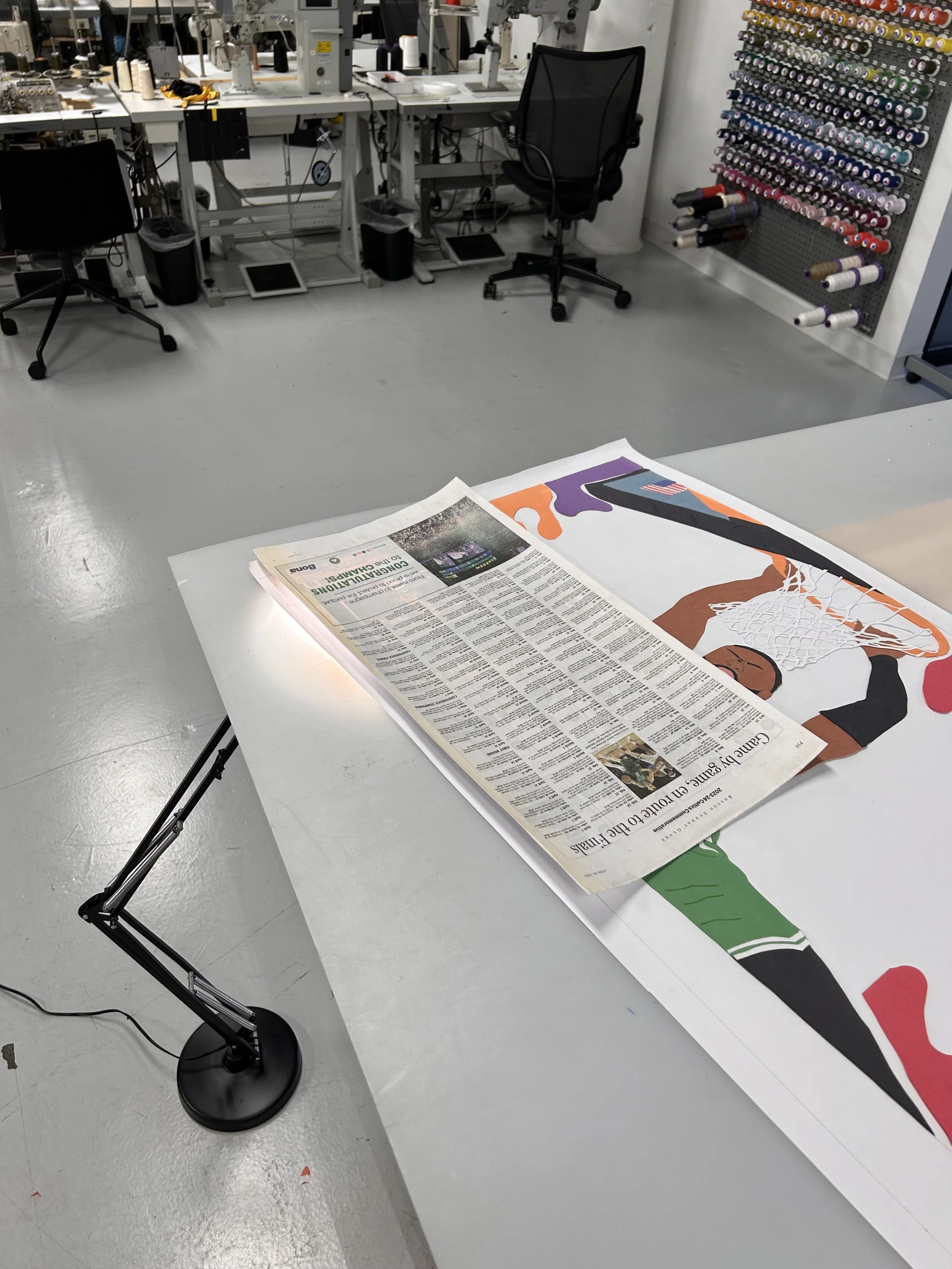
As an added touch, I included actual pieces of the Boston Globe from the day after the Celtics won the 2024 NBA Finals with the other abstract pieces
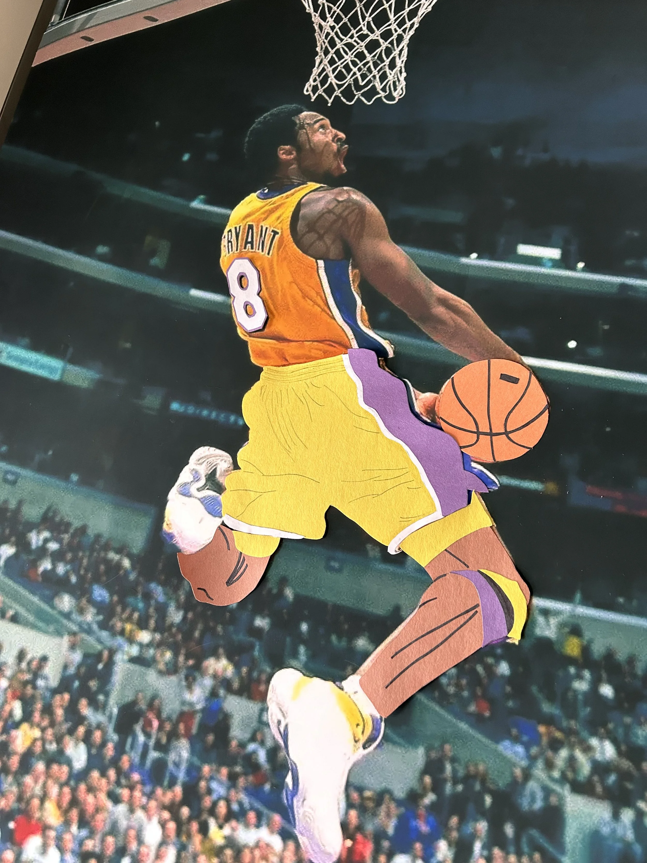
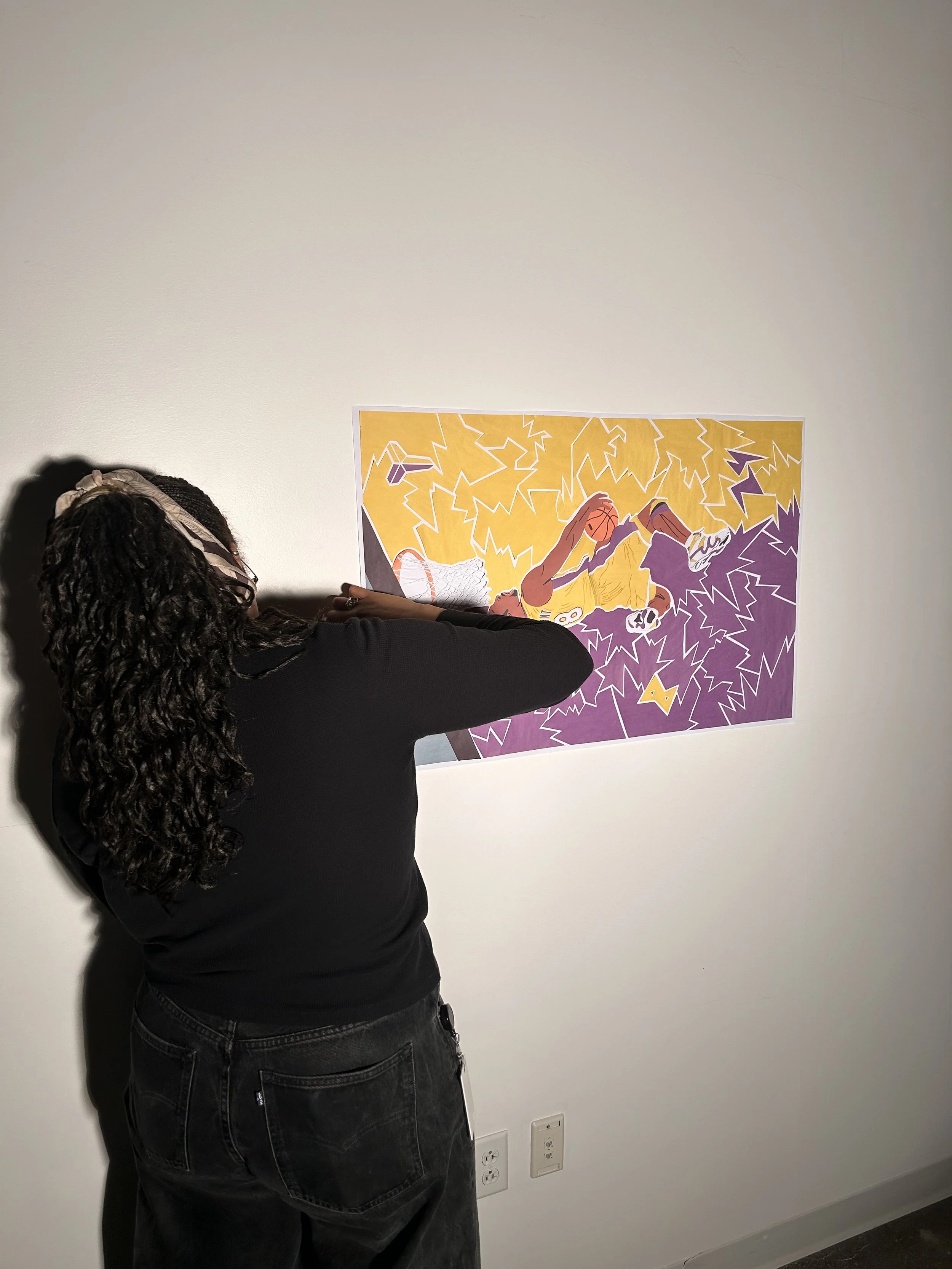
Kobe Bryant;
October, 2024
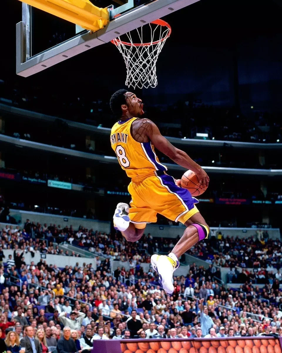
Reference image
A piece dedicated to ‘The Mamba’. A player who had a killer instinct and a mindset that I worked to emulate over my athletic career and continue to carry in my personal life.
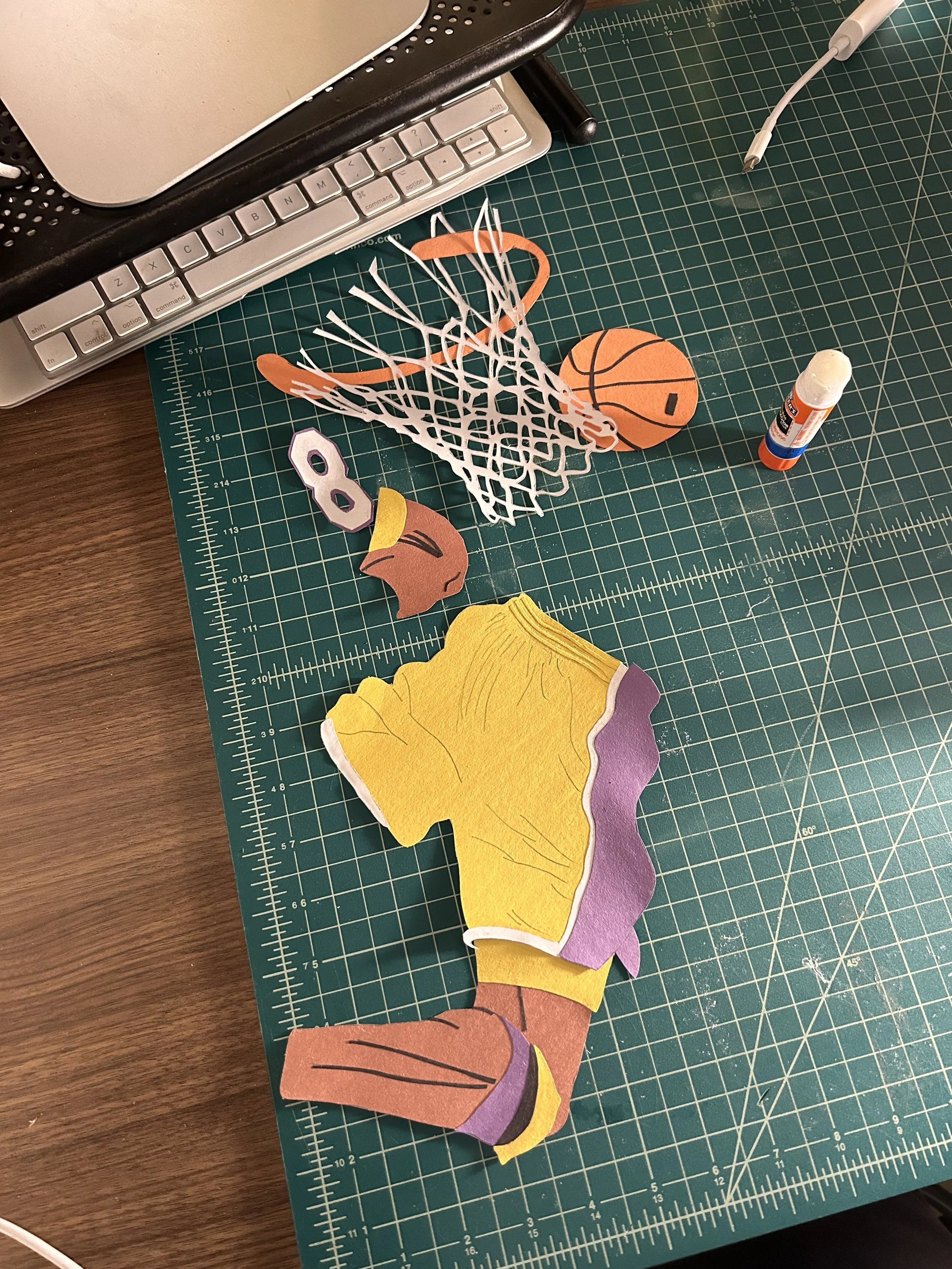
I found that I like to create small elements first (i.e. the net, ball, numbers, etc.) then assemble them together later
Through this process I found constant alignment to the reference ensures better accuracy
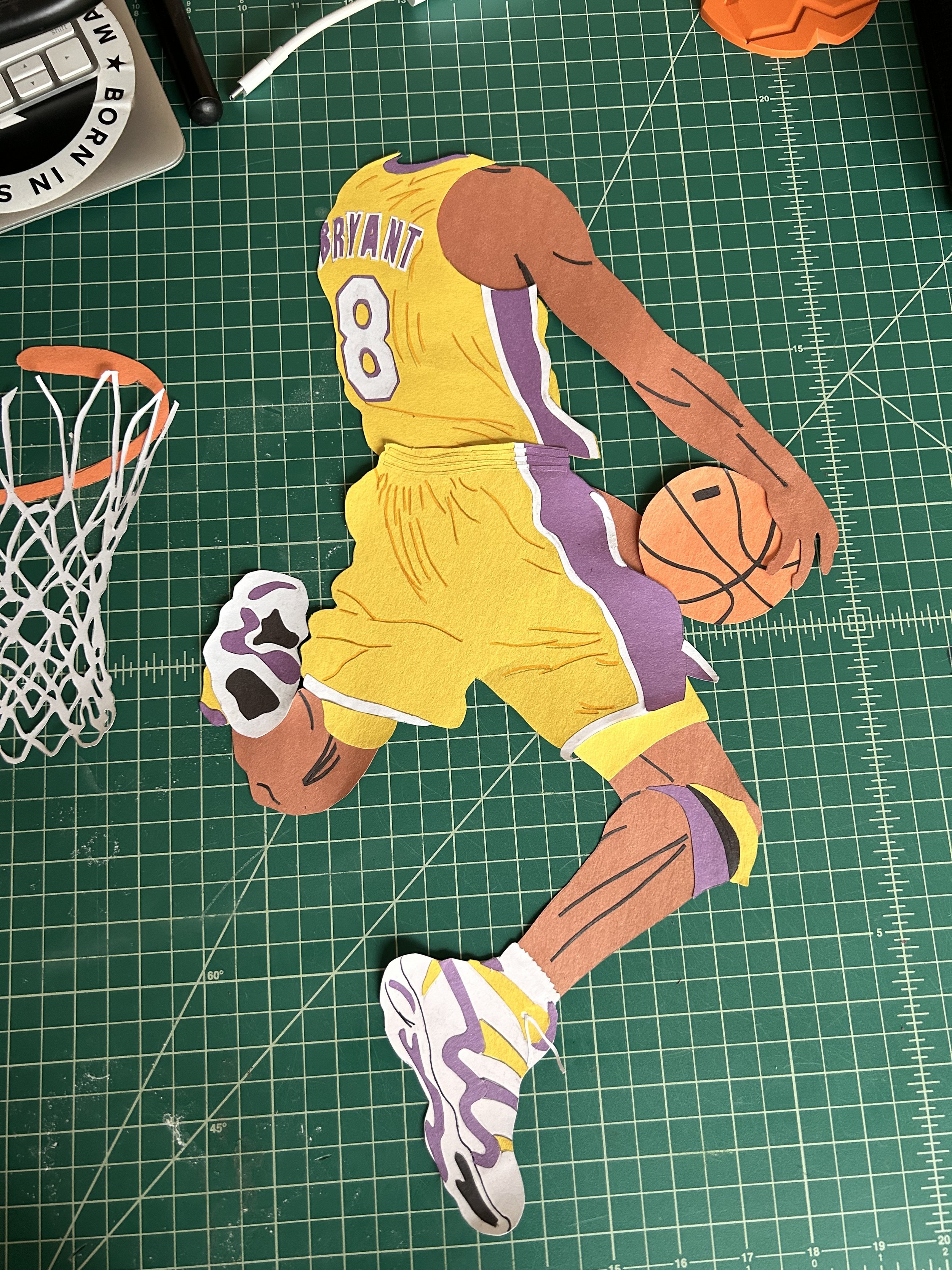
It's always an exciting part of the process when I connect the top and bottom half of the main subject together

Yellow and purple on either side represent Kobe's career transition from #8 to #24. Going from one mentality, style of play, and attitude to another
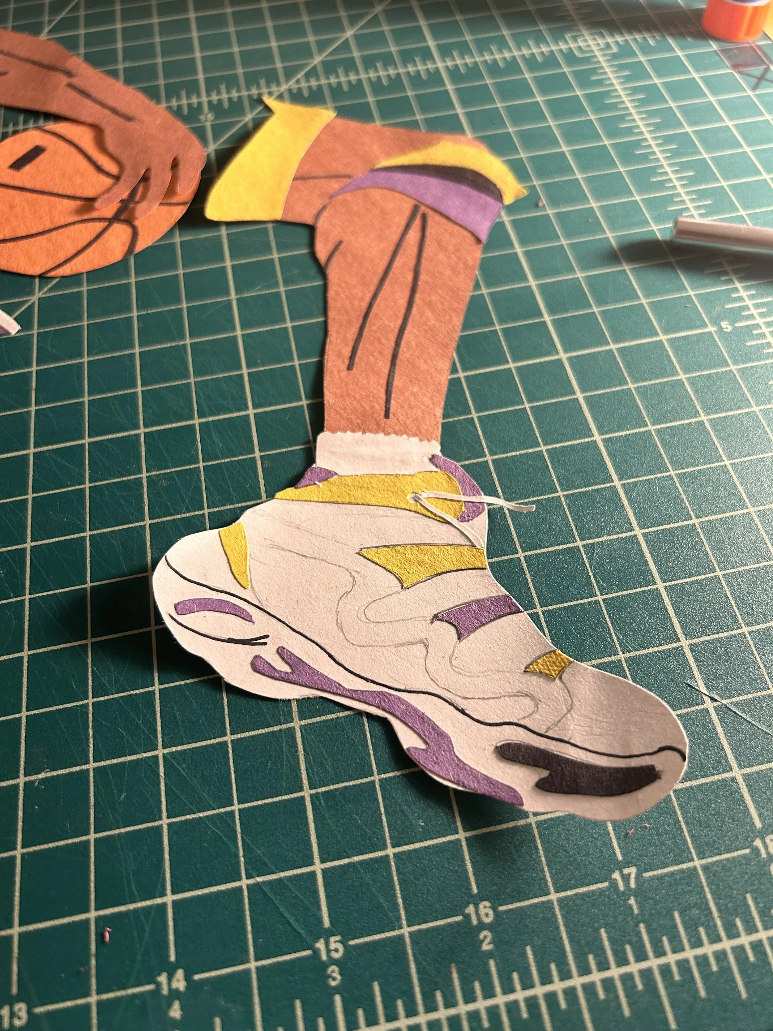
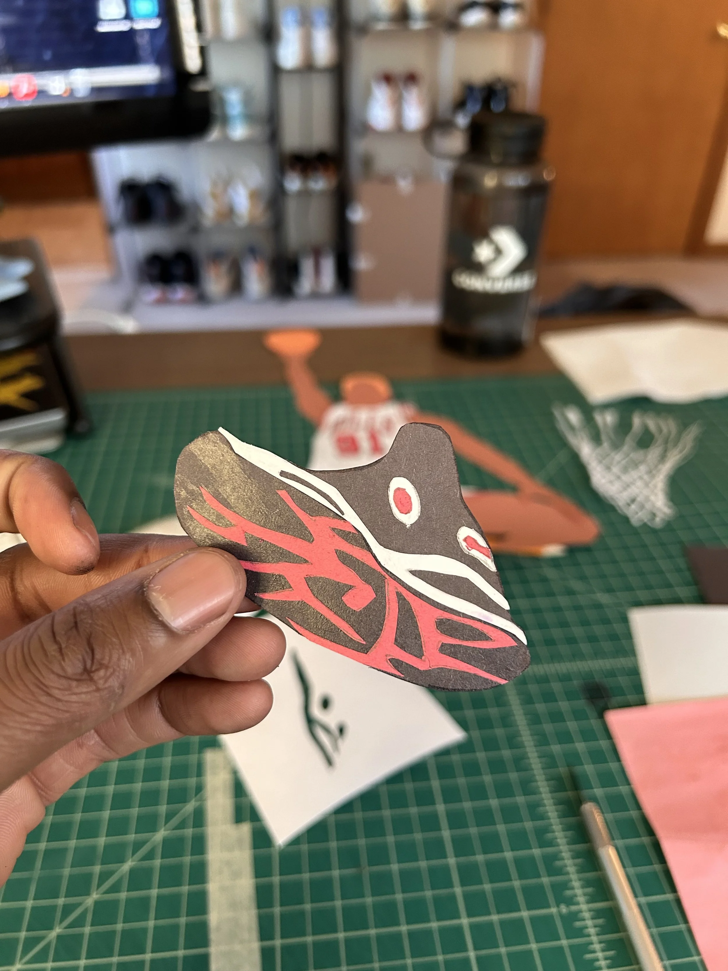
Trying to remake the exact shoe in the picture was hard. This is my version of the shoe if a Crazy 8 and an Adidas Pro Model had a kid

This reference image to me, screamed force, aggression, and fluidity all in one. My intent was to replicate those emotions with the surrounding, interlocking shapes
This was my attempt to refine the shape of the basketball grooves. Working to not rip the thin parts was a challenge

Placement on the canvas is always an important part of the process to ensure everything lines up to the frame size
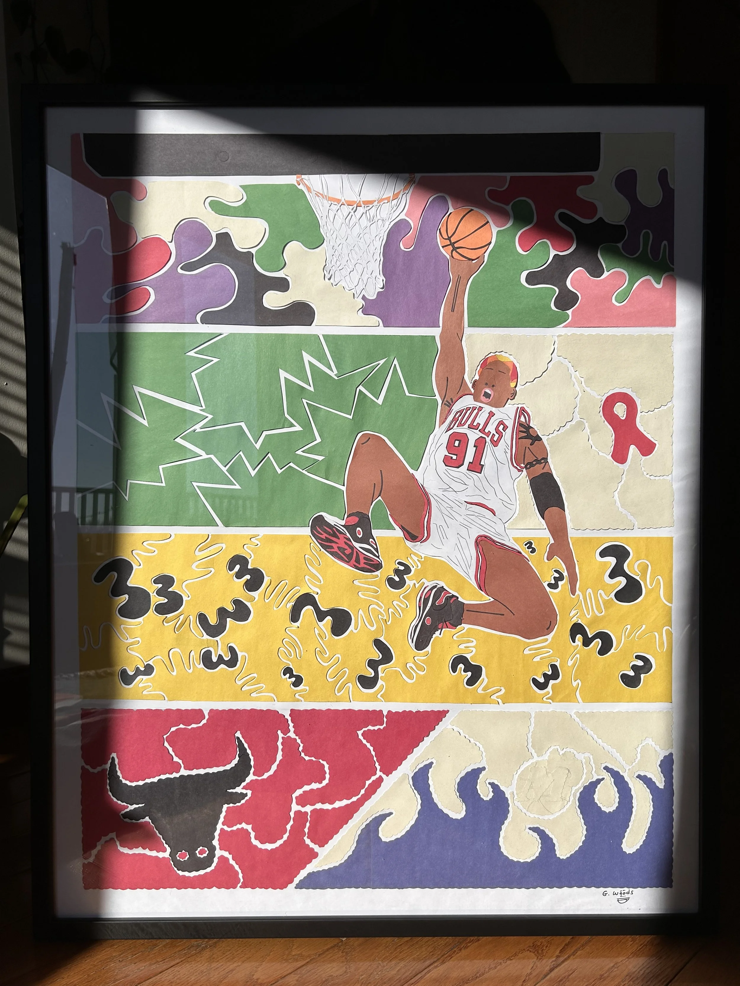
Dennis Rodman;
January, 2025
Reference image
This piece was done to commemorate a person who embodied that anti-“norm” spirit. A dominant force on the court and a captivating, sometimes controversial, style icon in the streets.
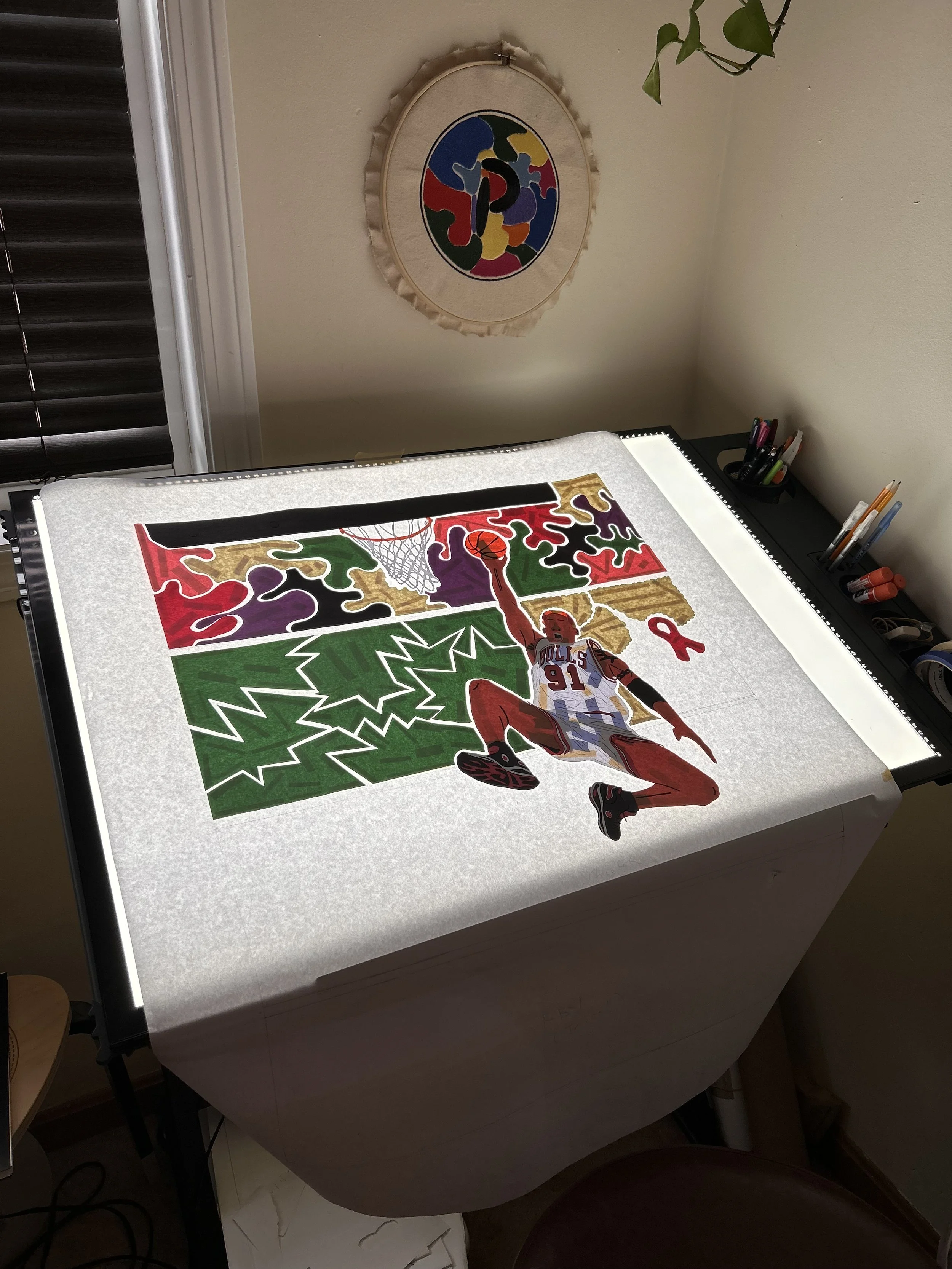
Each section represents a different hair style ‘The Worm’ wore in the NBA during the 90s while on the Pistons, Spurs, Bulls, and Mavericks.
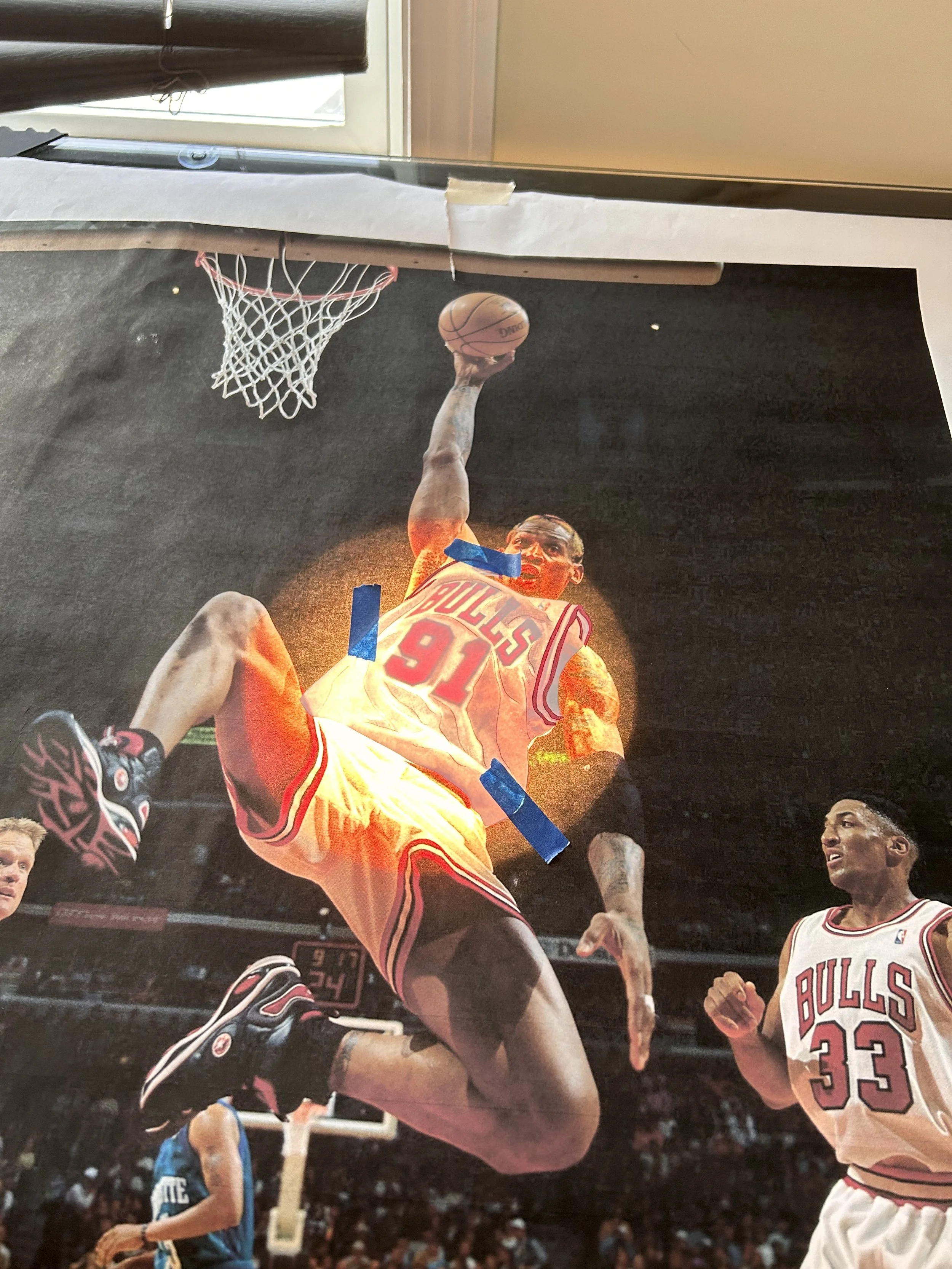
To emulate a tracing table I used a small lamp as my backlight beneath a glass surface. This worked, but the tracing window was very small
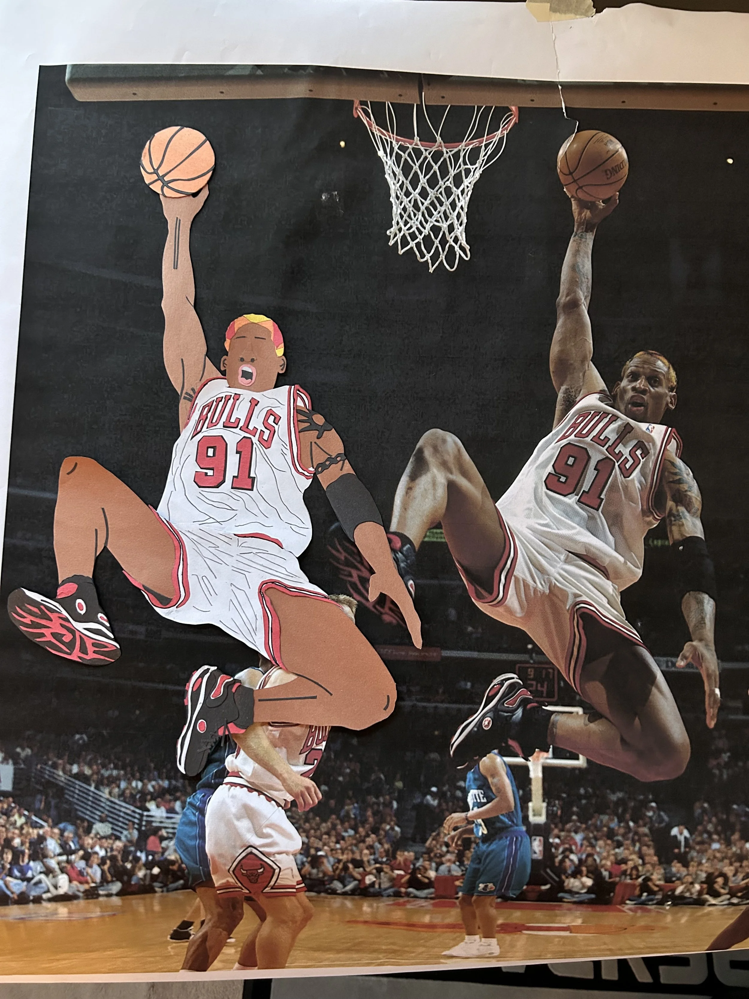
Side by side comparison to the reference image to spot check alignment and scale
The outsole of this shoe component alone is about 5-6 pieces. The shoe it self is about 13-16
My family had a secret Santa. I asked for an electric tooth brush, my more thoughtful brother in law got me an LED light table. This made my tracing more efficient and took that part of the process to the next level
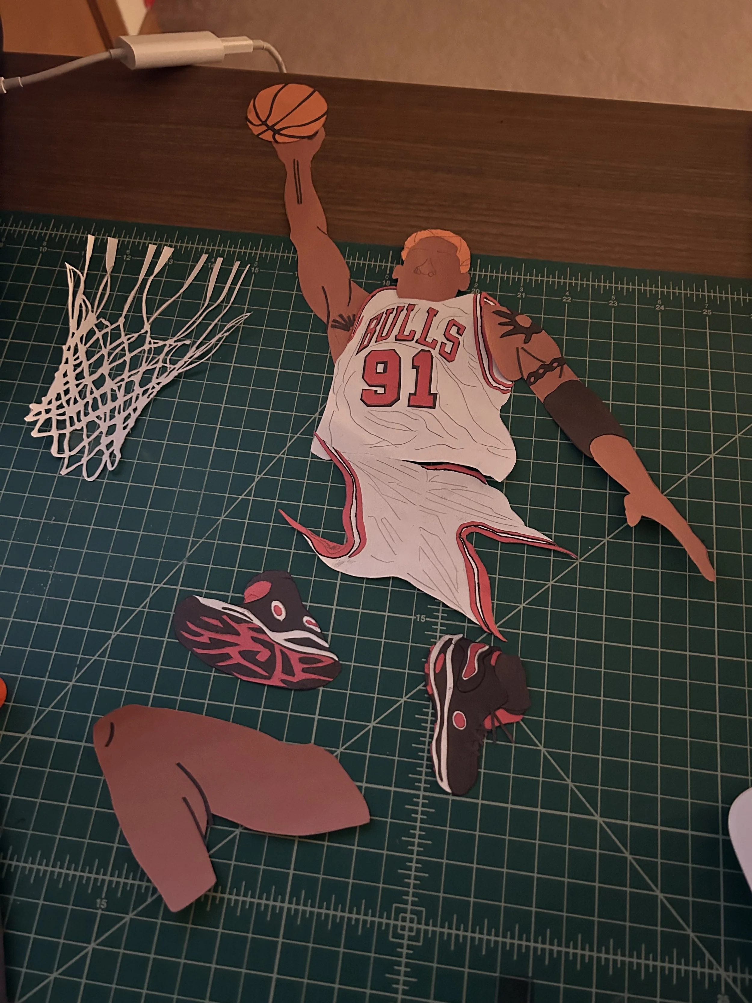
Laying out all of the separate elements to get a sense of the overall picture
Each section in this piece nods to a hairstyle Rodman wore during his career in the NBA. Clicking on this photo will bring you to the article I used as reference and inspiration
Shug;
April, 2025

Reference image
I wanted to branch out from athletes with this art form and do something different
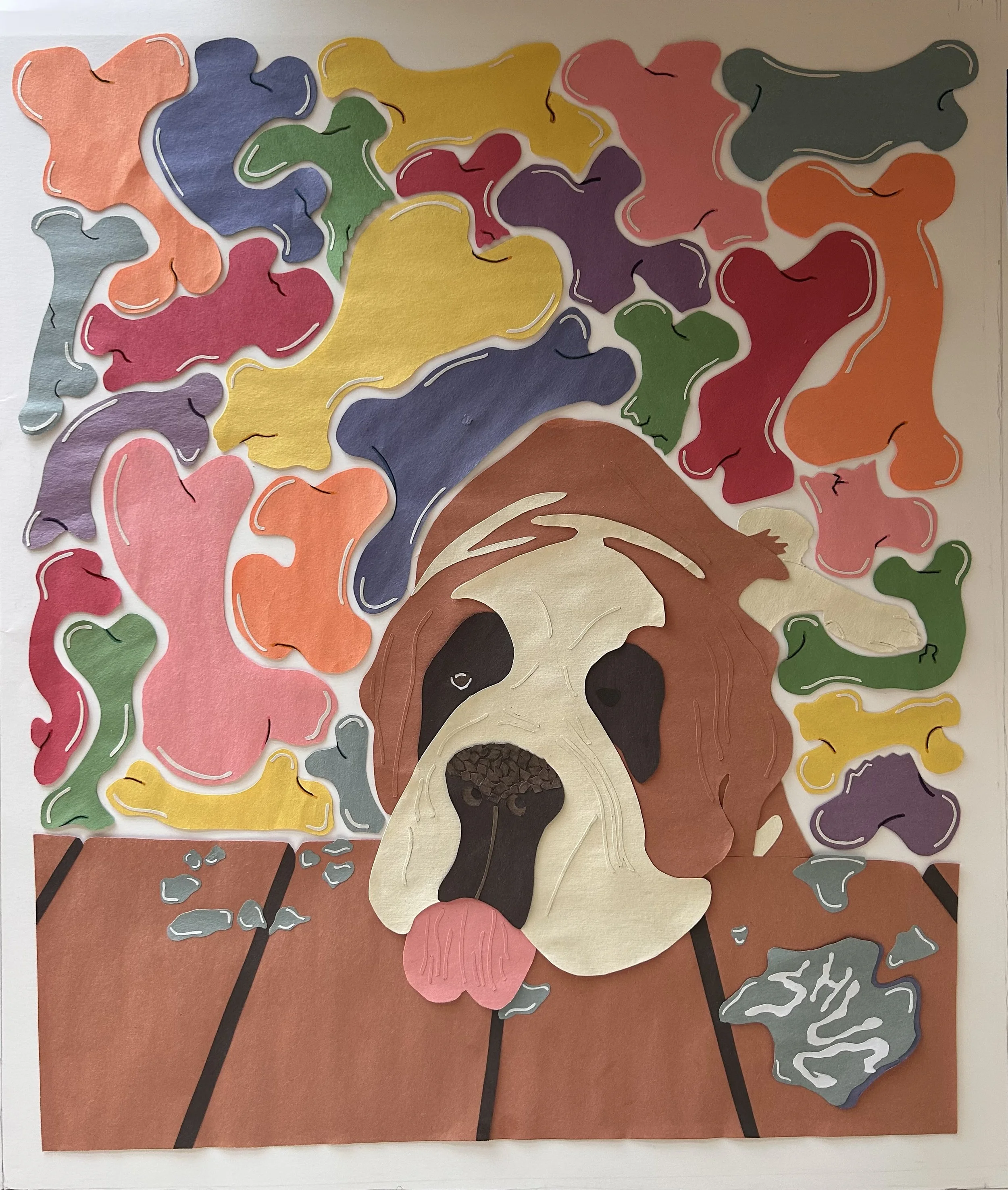
I made this piece as a gift for my Sister and Brother-in-Law, of their dog, Shug.
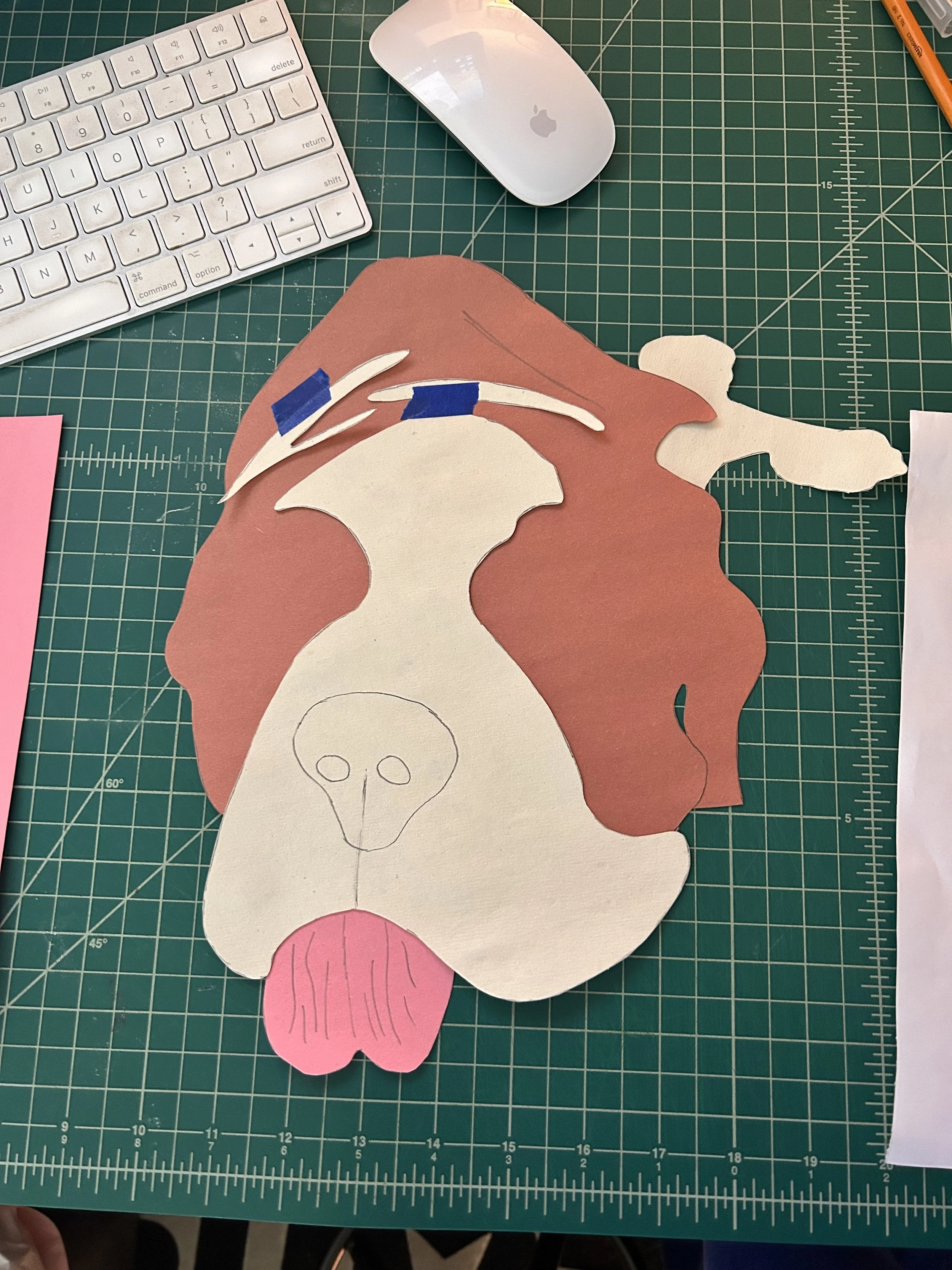
The black lines are a mark where I wanted to try accented grooves that highlight his wrinkles and make the piece pop
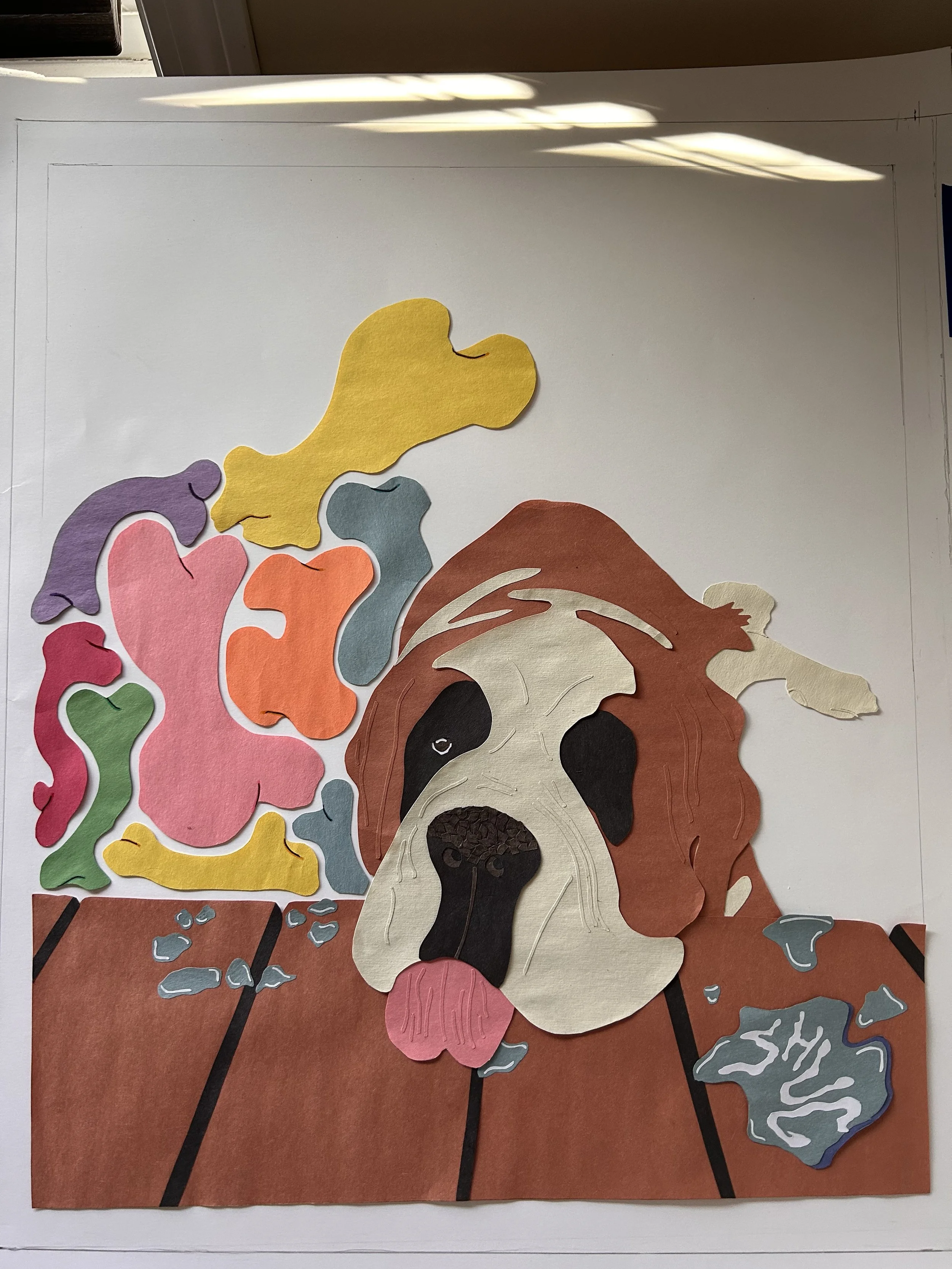
After a few pieces, I wasn't sure where to go next with the abstract shapes that make up the background. Since Shug is a dog, I thought bones with a twist were an appropriate fit
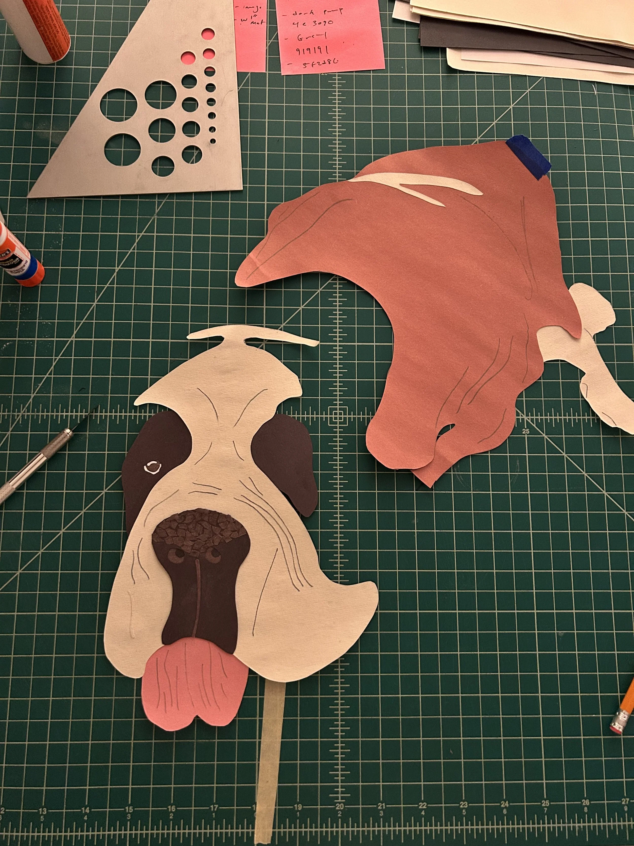
Shug is known for having a huge head, slobber, and having a crusty nose. I worked hard to capture as many of those elements as I could
Filling gaps and moving around the main subject while keeping a ‘bone’ shape proved to me more difficult than I originally thought
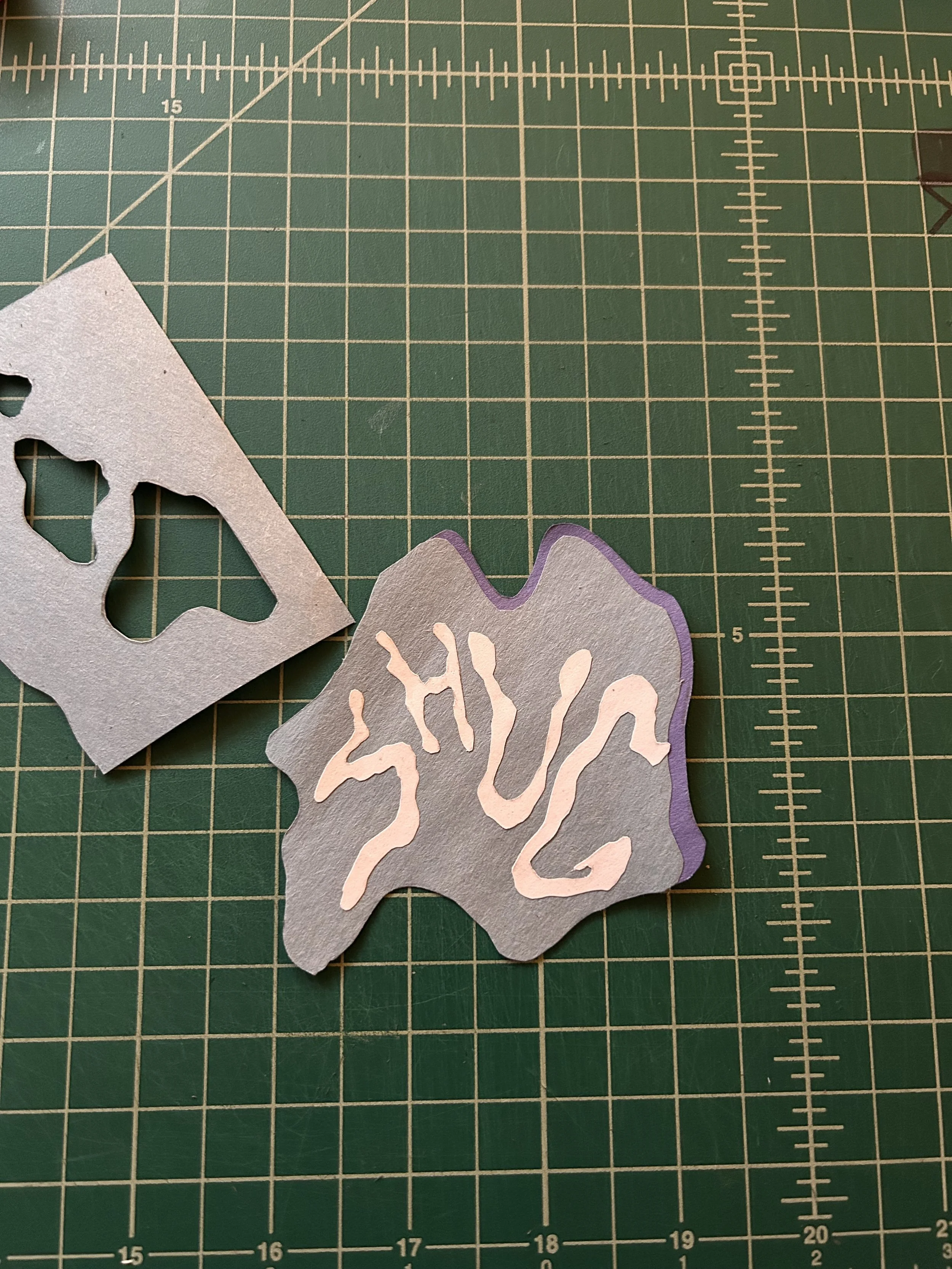
I wanted to include Shug’s name in the piece somewhere and thought that the drool puddle was the perfect place
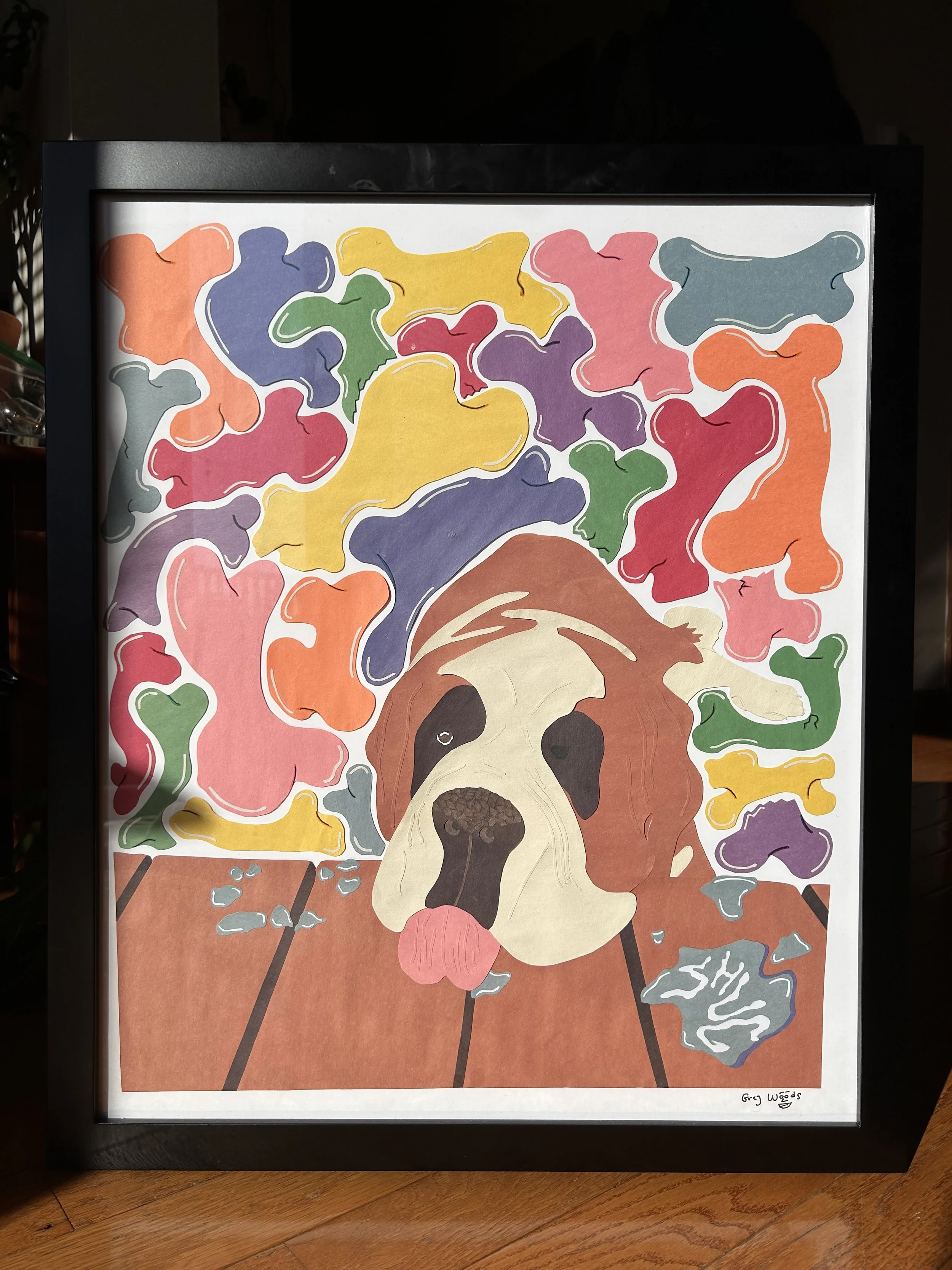
Final product finished and framed
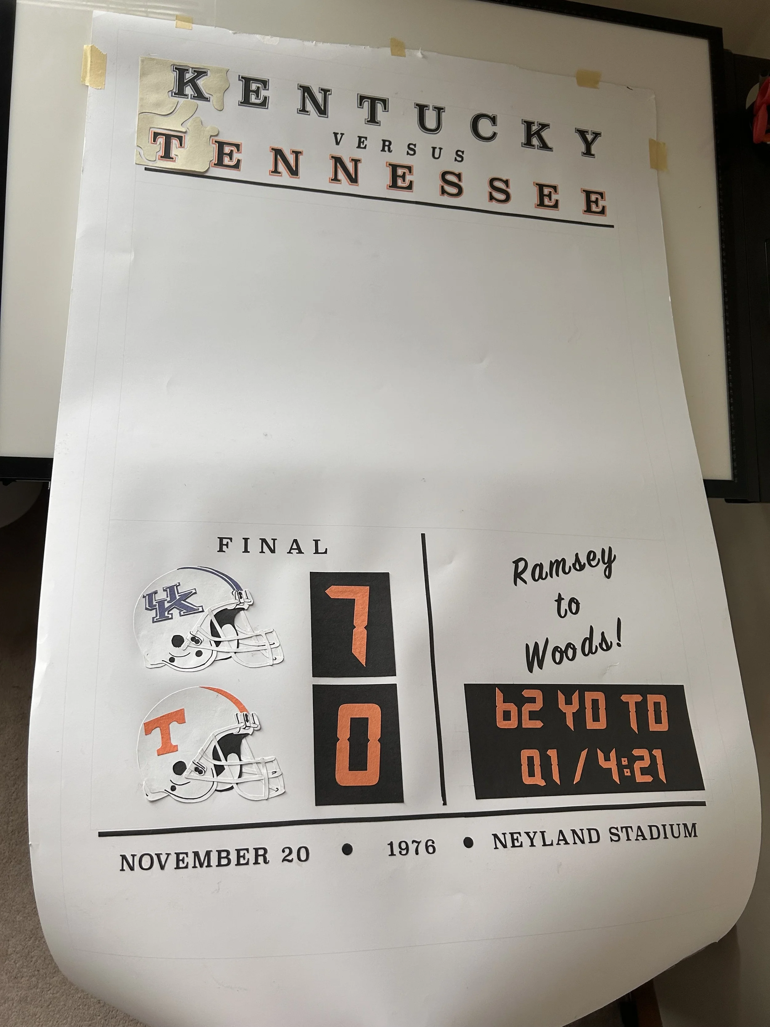
‘The Score’;
June, 2025

Reference image
On November 20th, 1976, my Dad scored the only touchdown in a pivotal game which helped the University of Kentucky on their path to reach the Peach Bowl his senior year.
I wanted to create this piece to pay homage to him, to capture the magnitude of the moment, and to branch out of my comfort zone in this craft by creating multiple, detailed figures.
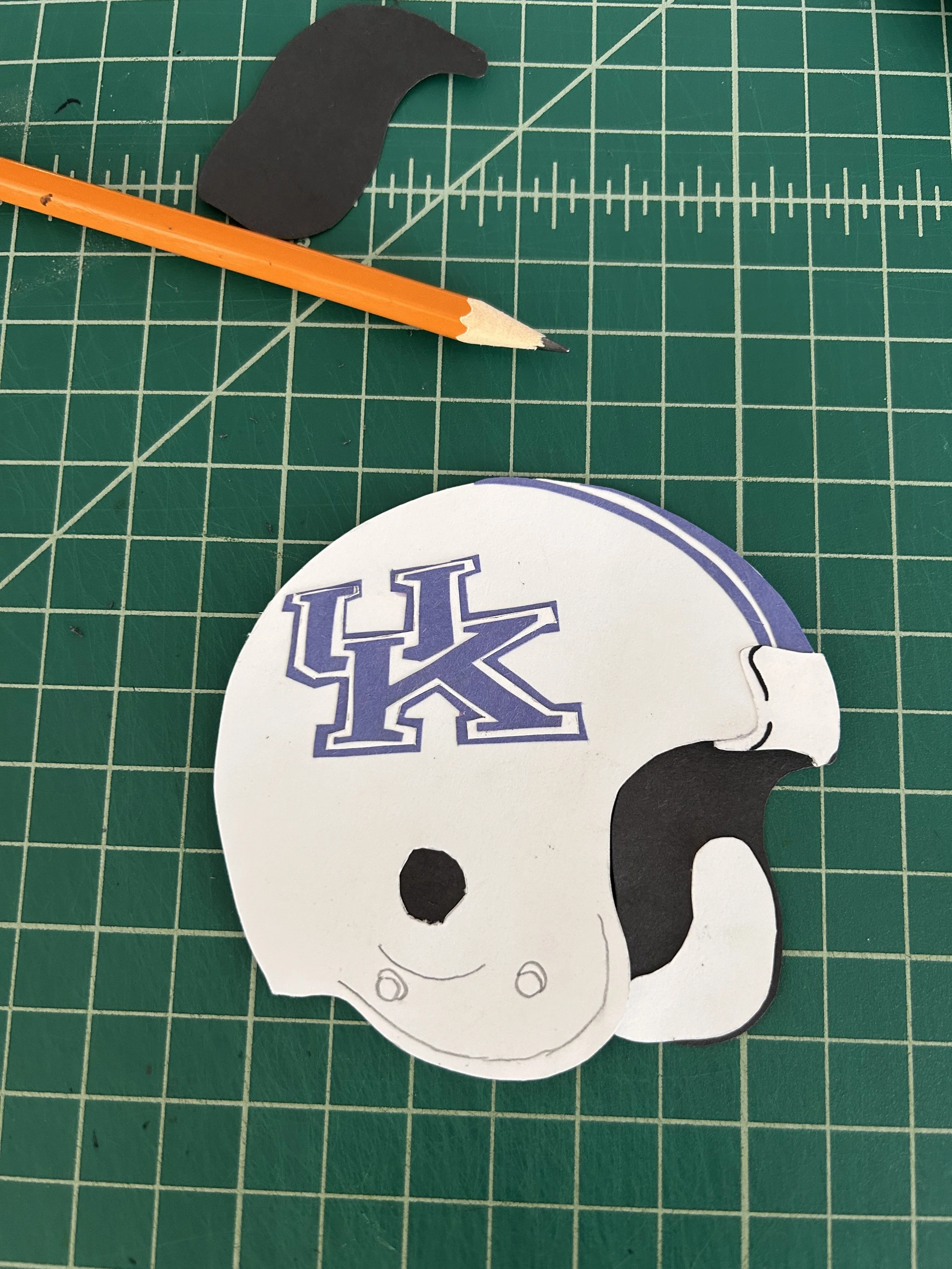
I started with the helmets as I wanted them to be some of the more detailed elements of the piece
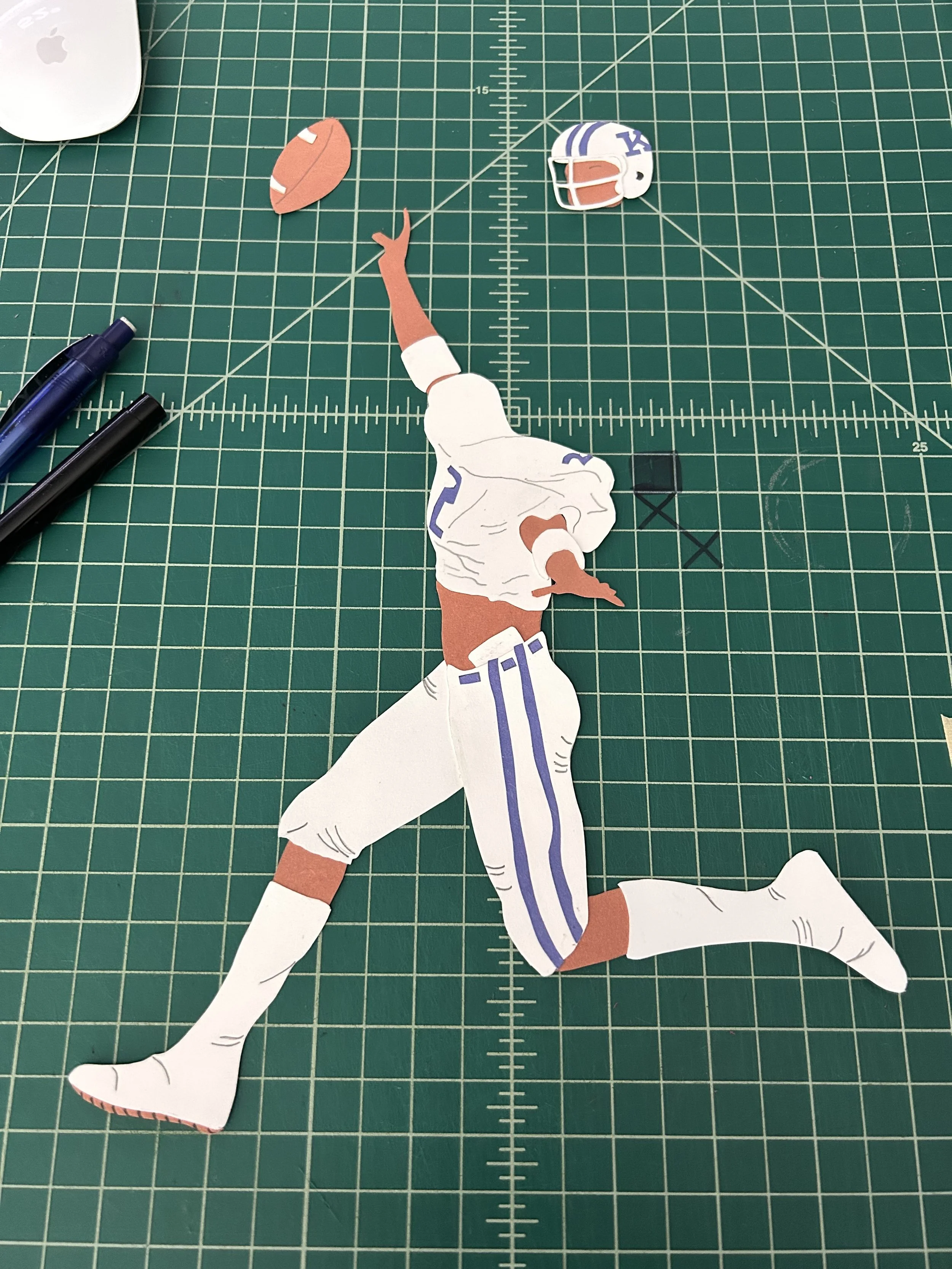
This piece was challenging because I created 3 very small figures instead of one large one. This was a great exercise in cutting fine details in smaller shapes
I wanted to recreate the look and feel of a vintage football poster for this piece which meant doing the background base in egret
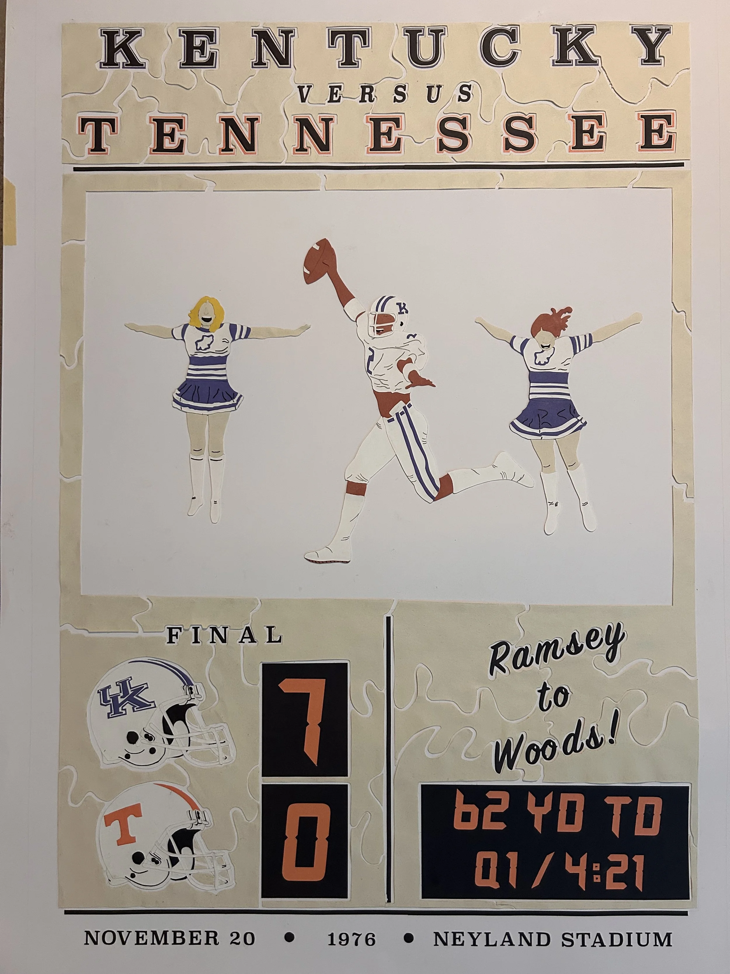
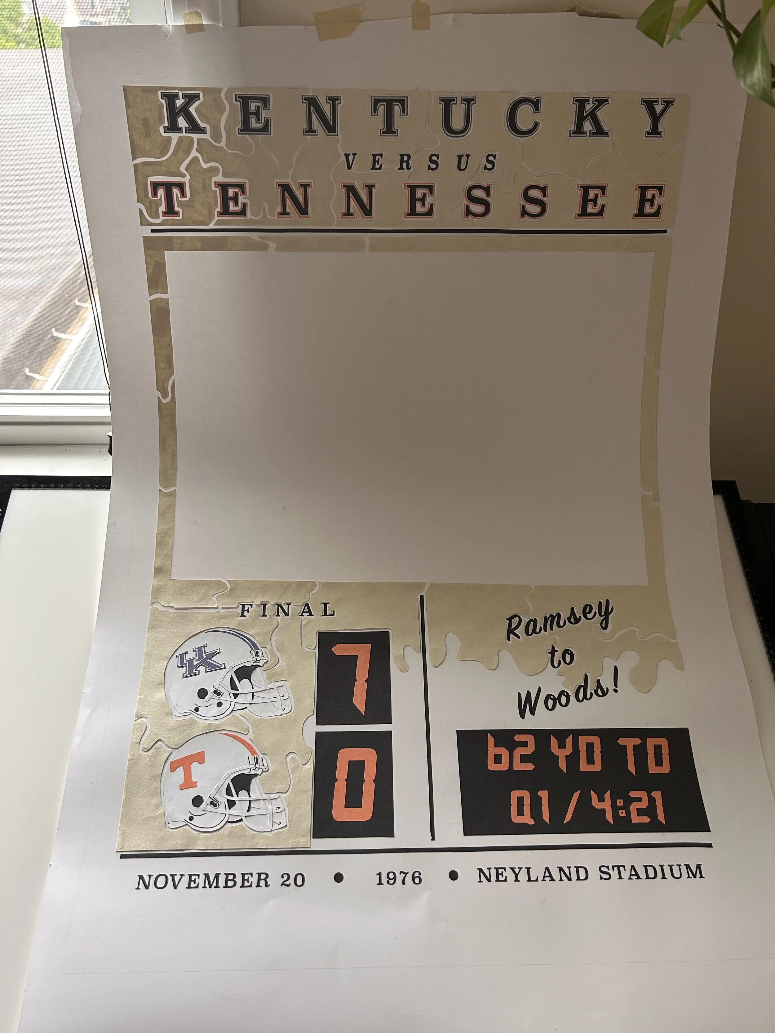
Laying out all of the elements onto the canvas before filling in the abstract shapes
I made sure to include specific details about the time, place, and players of the moment to give the piece a feeling
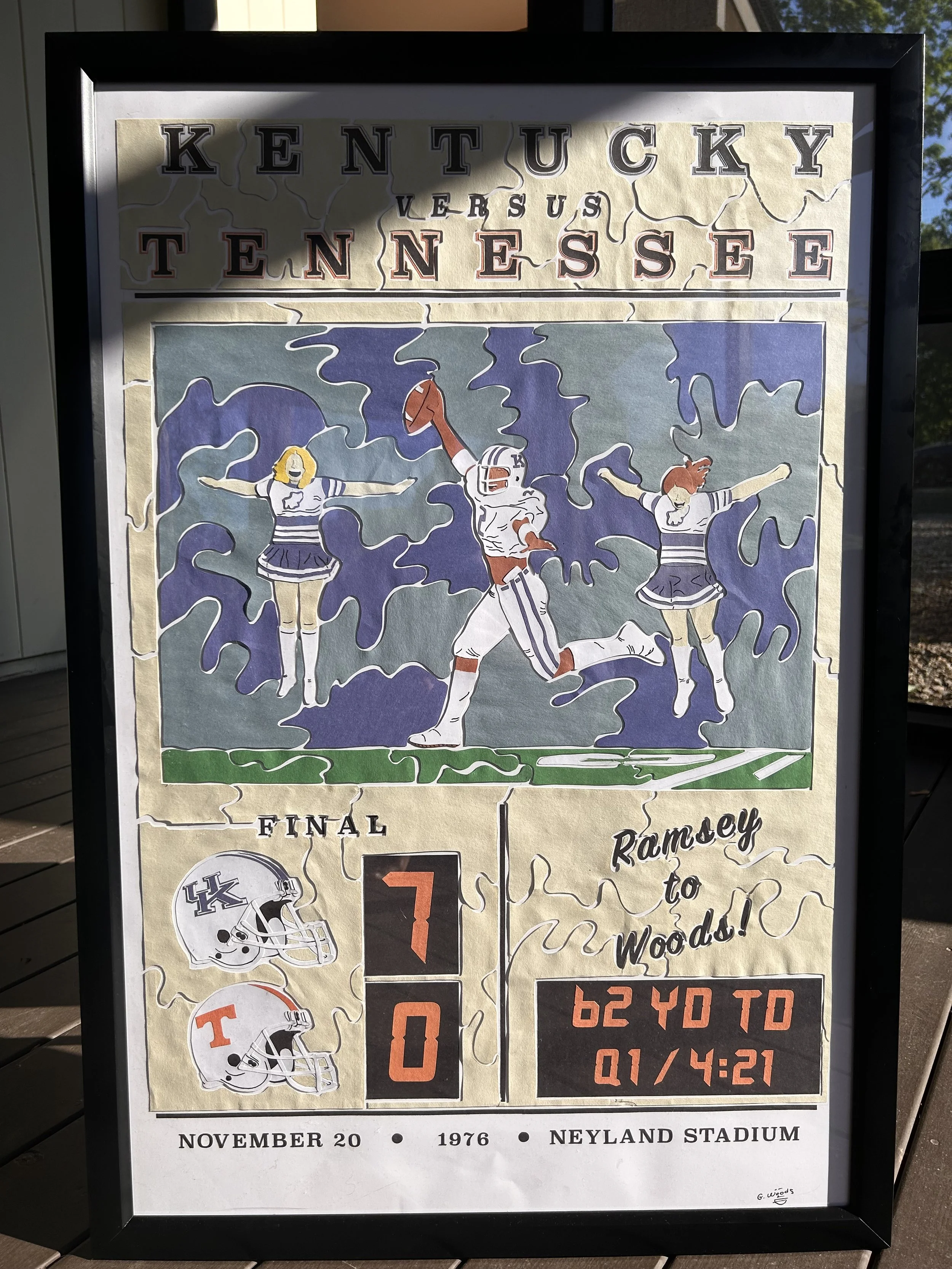
Final product finished and framed
Danroy Henry Sr.;
July, 2025
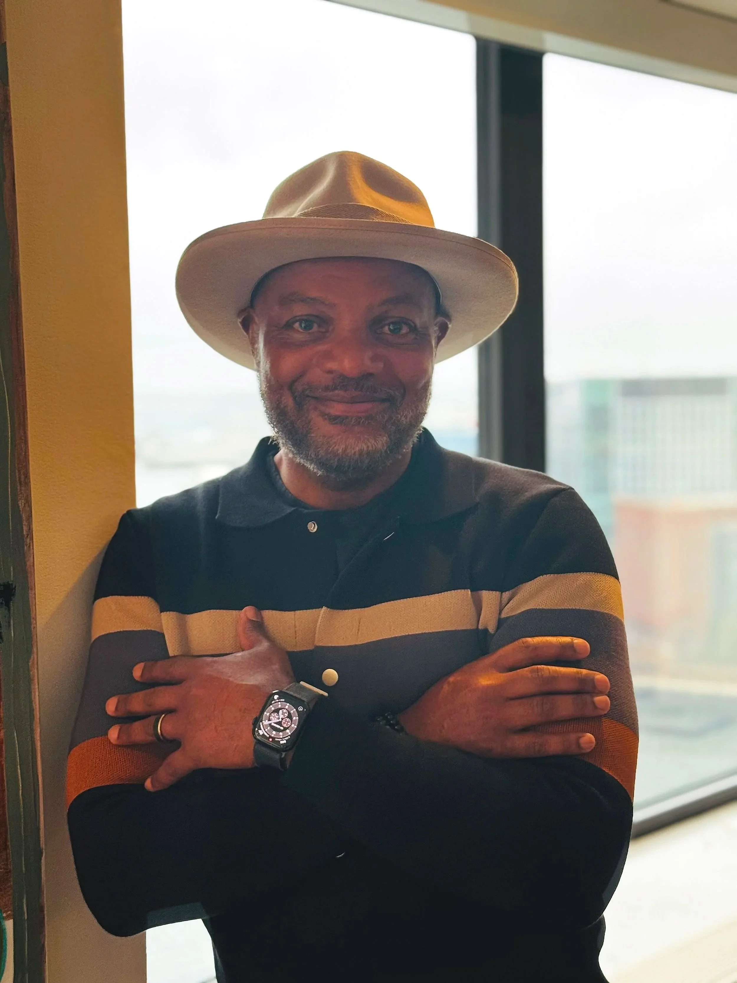
Reference image
Danroy Henry Sr. of Studio Danroy is featured in an installation at the Mariposa Museum in Oak Bluffs on Martha’s Vineyard. He asked me to create a portrait of him as a way to showcase my work alongside his.
I was beyond nervous as this would be the first portrait of anyone in my style. Making sure the likeness comes across as accurate gave me a new sense of urgency while creating. In doing this I discovered a new way my art could come to life.
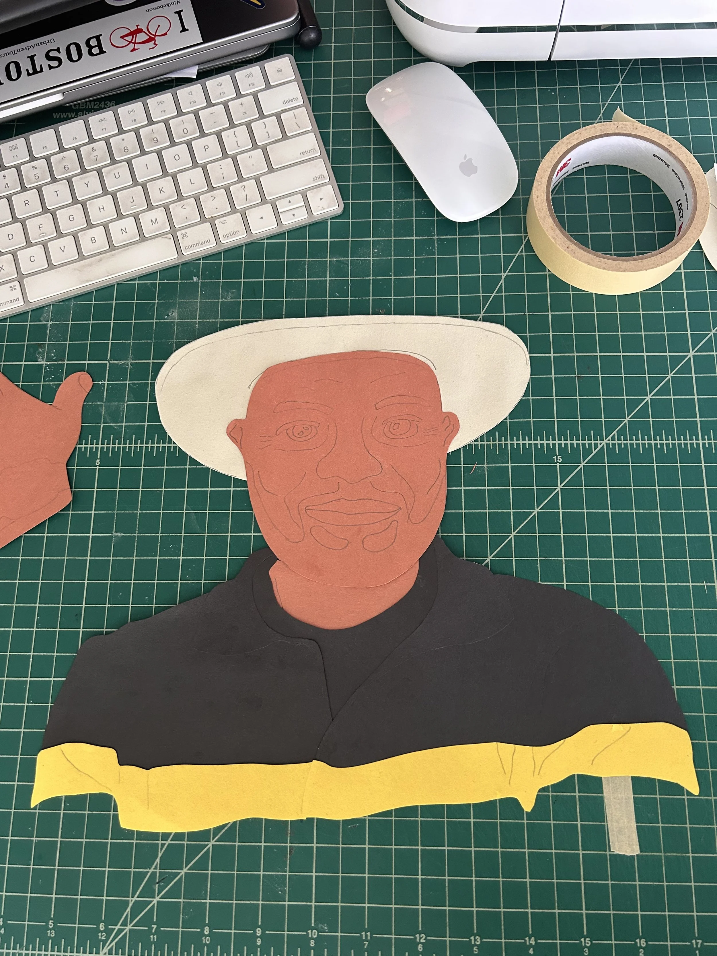
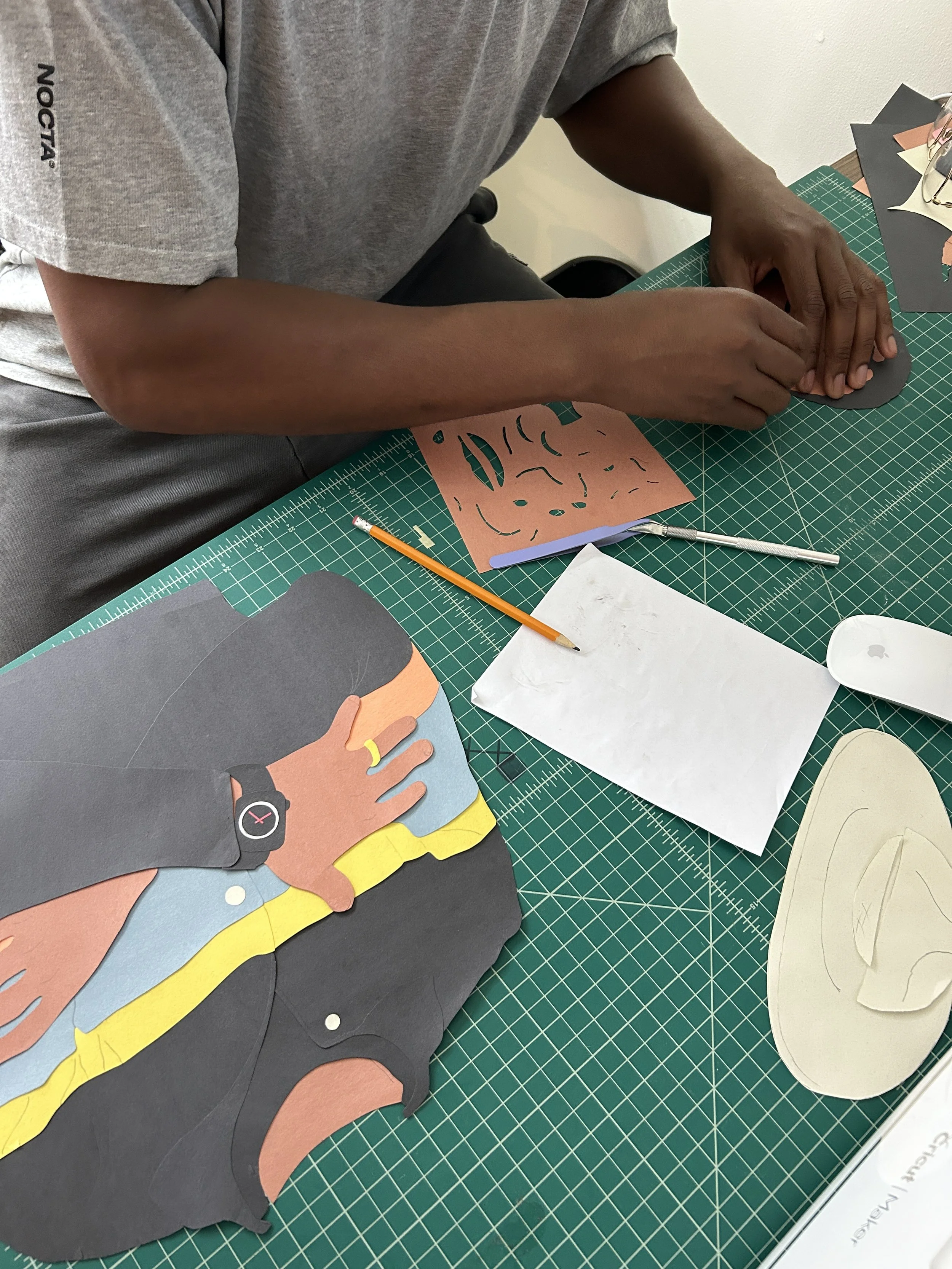
Using the tracing table I mapped out all of the notable facial features that make the subject, them
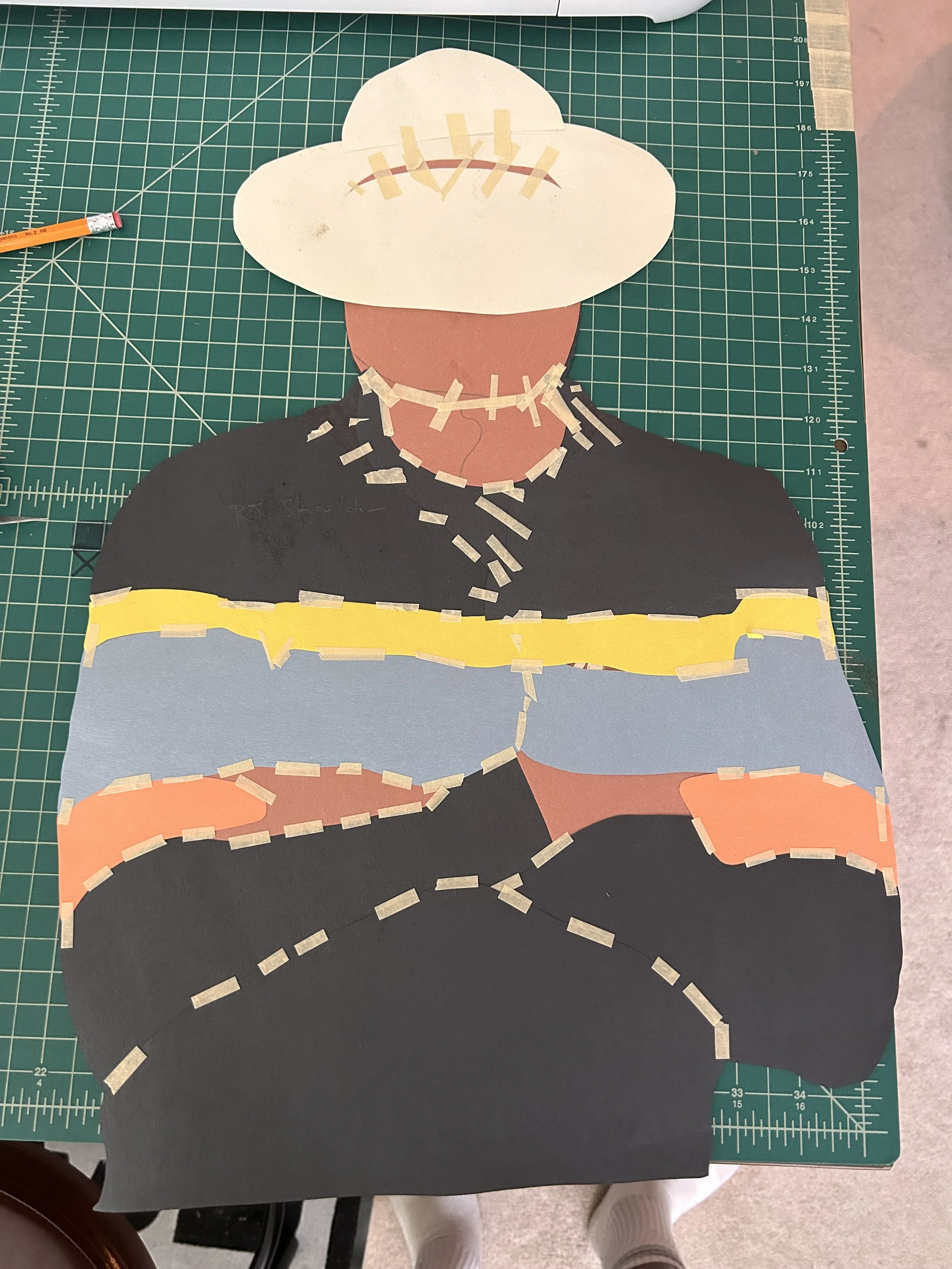
Clean on the front, chaos in the back. I took this picture to highlight how all of the layers come together behind in a piece to give a uniform look
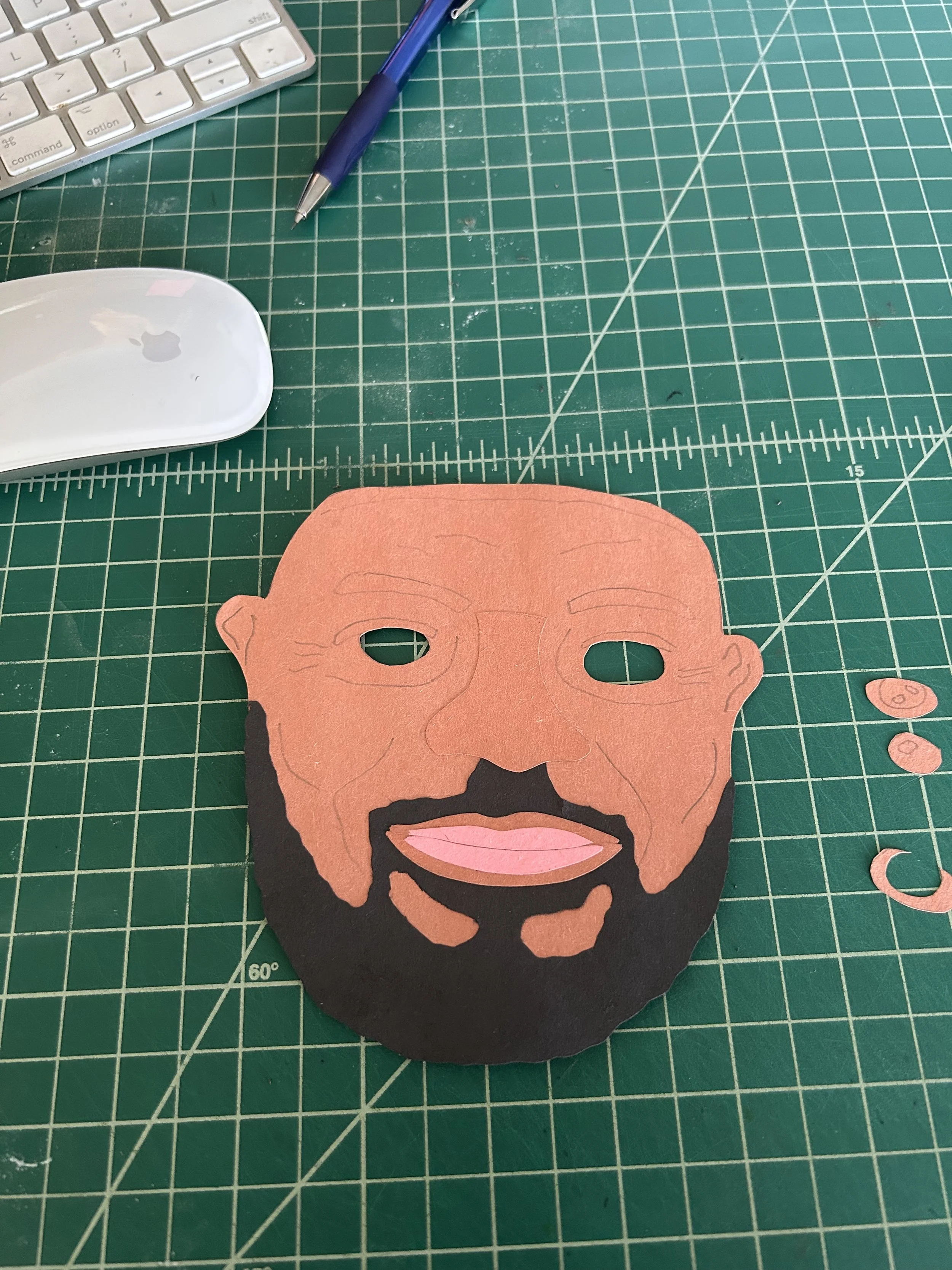
To create additional dimension in 2D, I added raised elements with thin strips of paper to mimic the look of cheekbones, lips, eyelids, etc.
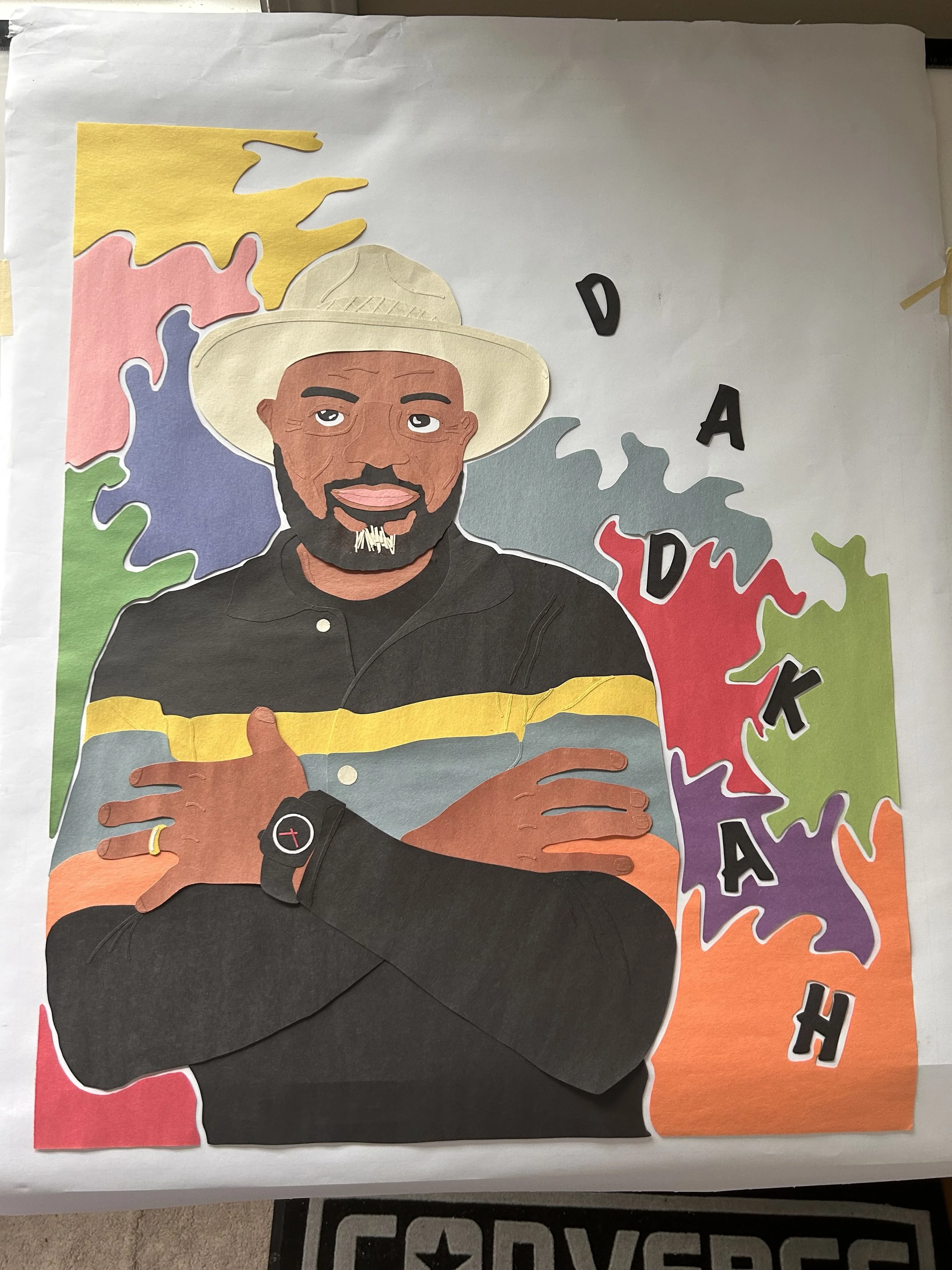
DADKAH represents the unity of Henry Family. It is the first initial of all of the family member’s names as well as the first initial of their last name
Finding ways to add in hidden details has been a lot of fun. Danroy Sr. was born on 10/8 so I set the hands on his Apple Watch to read 10:08

Final product finished and framed
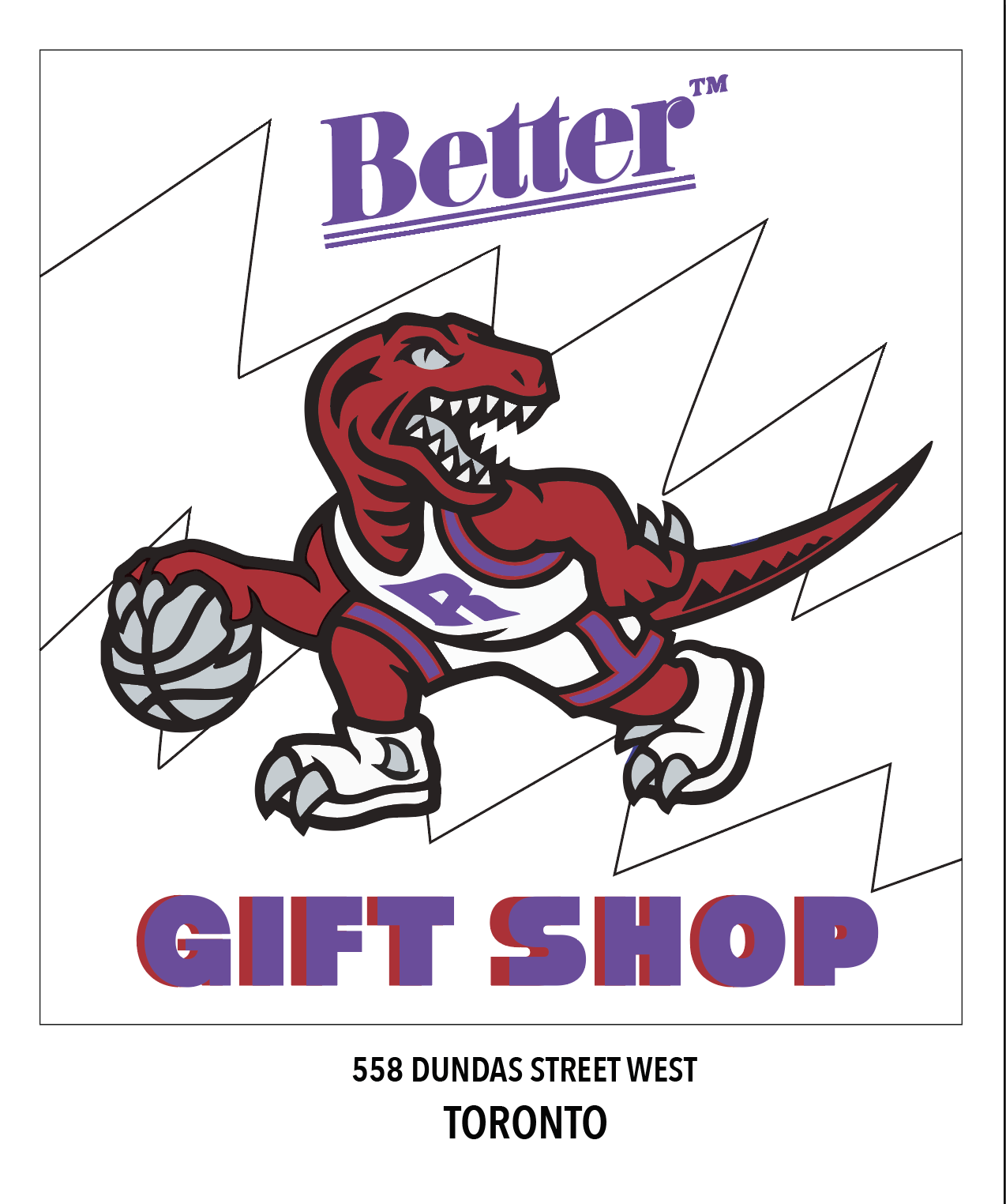
Better Gift Shop;
July, 2025

Reference image
In April, a group of friends and I took a weekend trip to Toronto, CA. We were visiting a bunch of retail shops throughout our time and by chance I saw, and wanted to stop in an unassuming, frankly rundown looking, shop.
This happened to be one of the 6’s hidden gems. The owner, Avi Gold, showed us hospitality beyond measure and welcomed us into the city better than we could’ve expected.
This piece is a gift of appreciation for him and the shop.
For this piece I first started in Illustrator to create an outline concept of what I wanted to put on paper
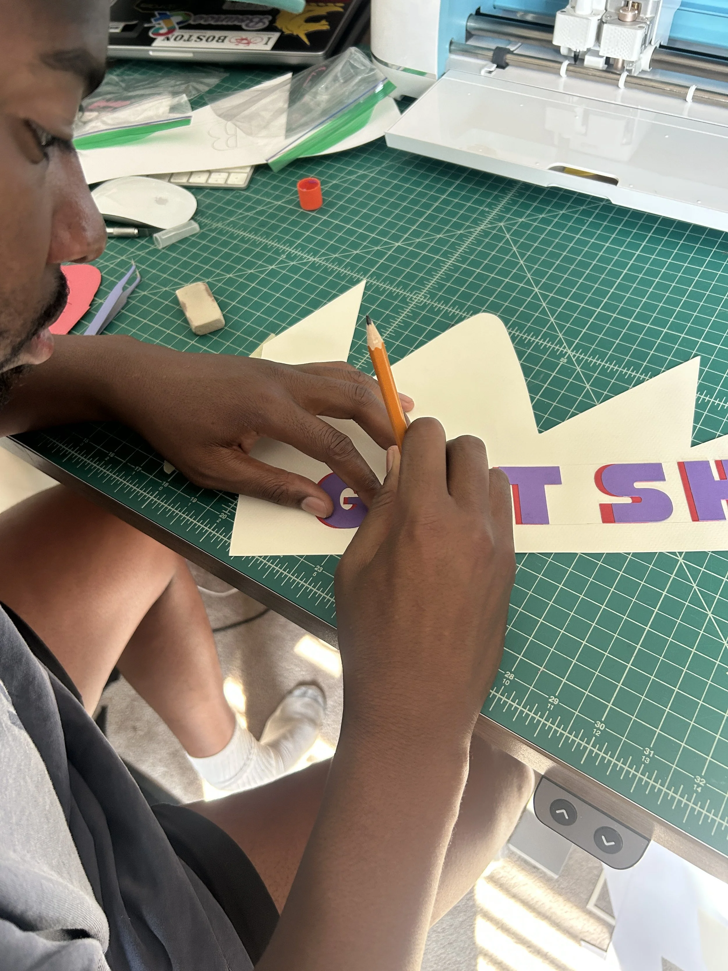
I utilized my Cricut cutting machine for the lettering. This came out better than expected and gives the piece an almost print like feel
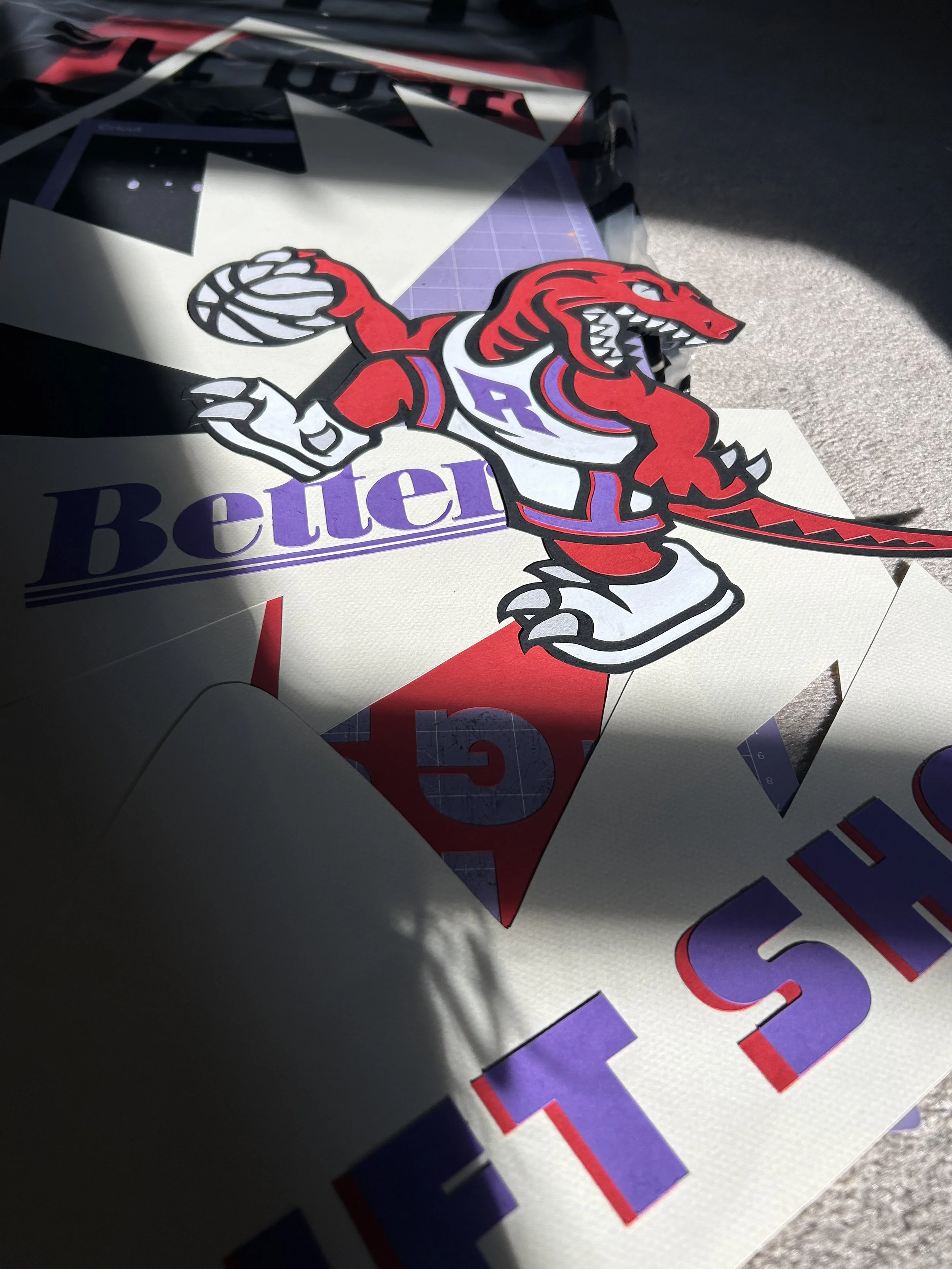
I used 98lb cardstock versus traditional construction paper. This made the raptor and lettering jump off the page from both a color and depth perspective
This video is a look into how I place the letters in the proper orientation for the actual piece using the light table
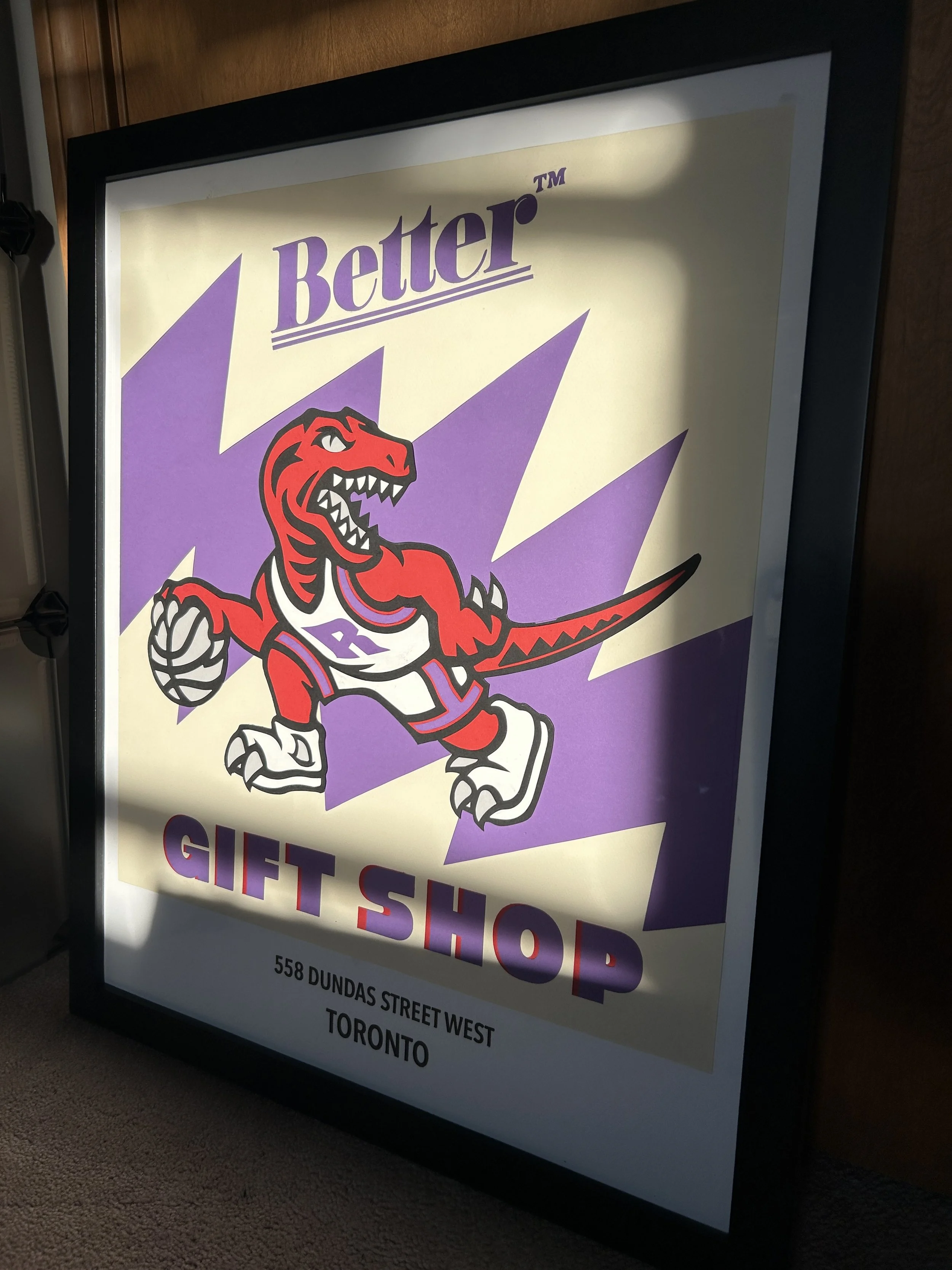
Final product finished and framed
Printmaking
Process

Example of a print after color correction, texture, and white space editing using Adobe Illustrator
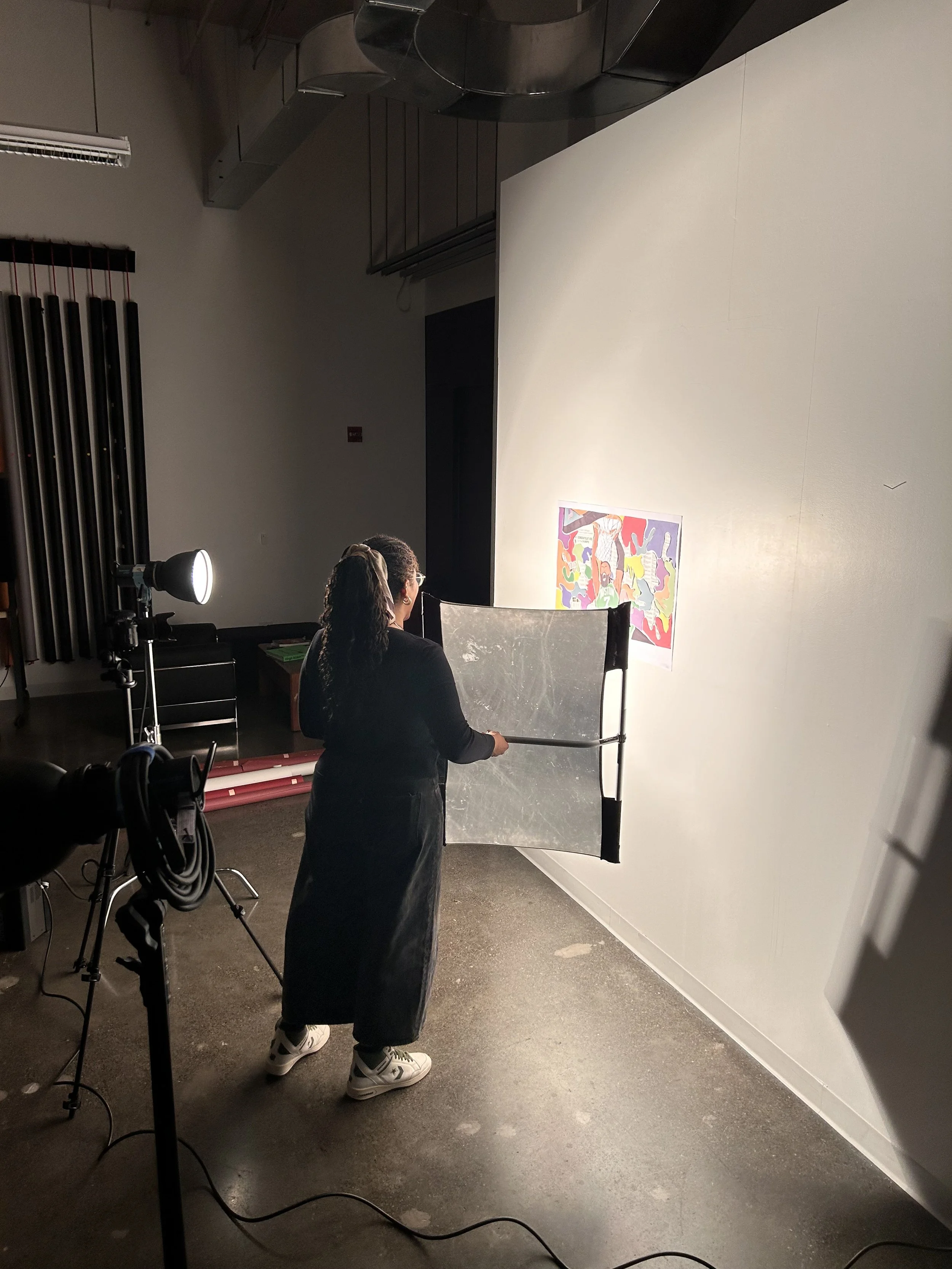
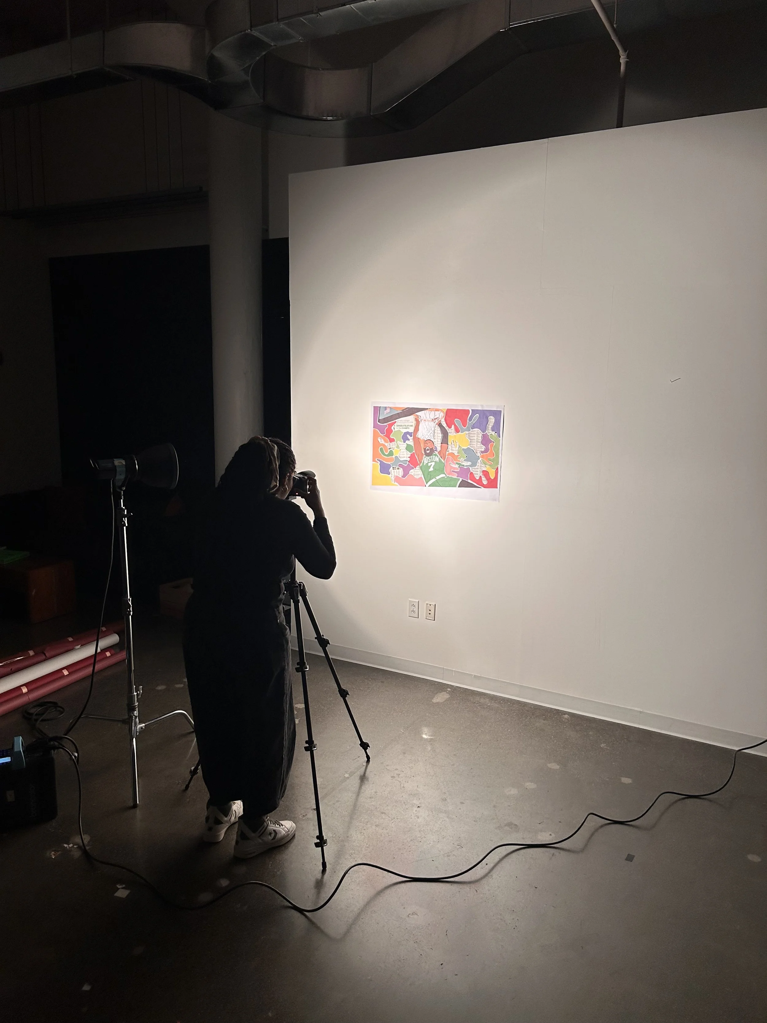
In general, there are two main ways to make a print of artwork.
One way is by scanning it in a flat bed that transcribes it into digital form that can then be edited. This is a great option if your image is flat, and within a width and height range that the machine can accommodate.
If your image is outside of the size range, a great second option is to capture a high quality image on a flat surface using a DSLR (digital single-lens reflex) camera. Once you have your image, you can edit everything from color to texture as needed in programs like Photoshop and LightRoom
My talented friend Nico showed me the ropes and helped me make the first prints of select pieces using the DSLR method. It was a fun day of learning and laughing together.